

Location Discovery App: Drop A Pin
Role
UX/UI Designer · Researcher · Brand Strategist


Timeline
Spring 2025
7 Weeks

Scope
UX/UI · App Design · Mural ·
Brand Identity · Prototyping

A visual, location-based discovery app for finding, saving, and sharing the places that matter.
There's no good tool for the way people actually want to save places. Screenshots get buried, Google Maps feels like a database, and Pinterest has no real-world map.
The design landscape for location-based apps is split: tools that navigate well, and tools that inspire visually. Drop A Pin is a conceptual mobile app that bridges that gap, giving Gen Z and Millennial explorers a place to discover, save, and share meaningful locations through a visual, board-based interface.
As the sole UX/UI designer, I owned the full process from research and competitive strategy through brand identity, wireframing, and high-fidelity prototyping.
Overview
No existing tool blends the visual appeal of Pinterest with the practical utility of Google Maps. Users who want to remember a great coffee shop or a scenic lookout have nowhere to do it beautifully, socially, or with any sense of curation. Drop A Pin was built to fill that gap.
Build a visual identity that feels expressive, modern, and an immediate download
Design a UX that makes map navigation and board organization feel seamless
Create a system that amplifies small and local business discovery through user-generated content
Deliver a prototype that proves the concept works end-to-end, not just aesthetically
Objectives
Process
Drop A Pin was designed for Gen Z and Millennial explorers who value visual storytelling, thoughtful design, and intentional experiences. These are people who travel with purpose, document with care, and actively seek out local and independent businesses over chains.
This audience is socially connected and visually driven, meaning they expect the tools they use to look as good as the places they are saving. They are not looking for another navigation app. They want something that feels personal, curated, and worth sharing, a platform that turns their favorite places into a collection, not just an unorganized list.
Target Audience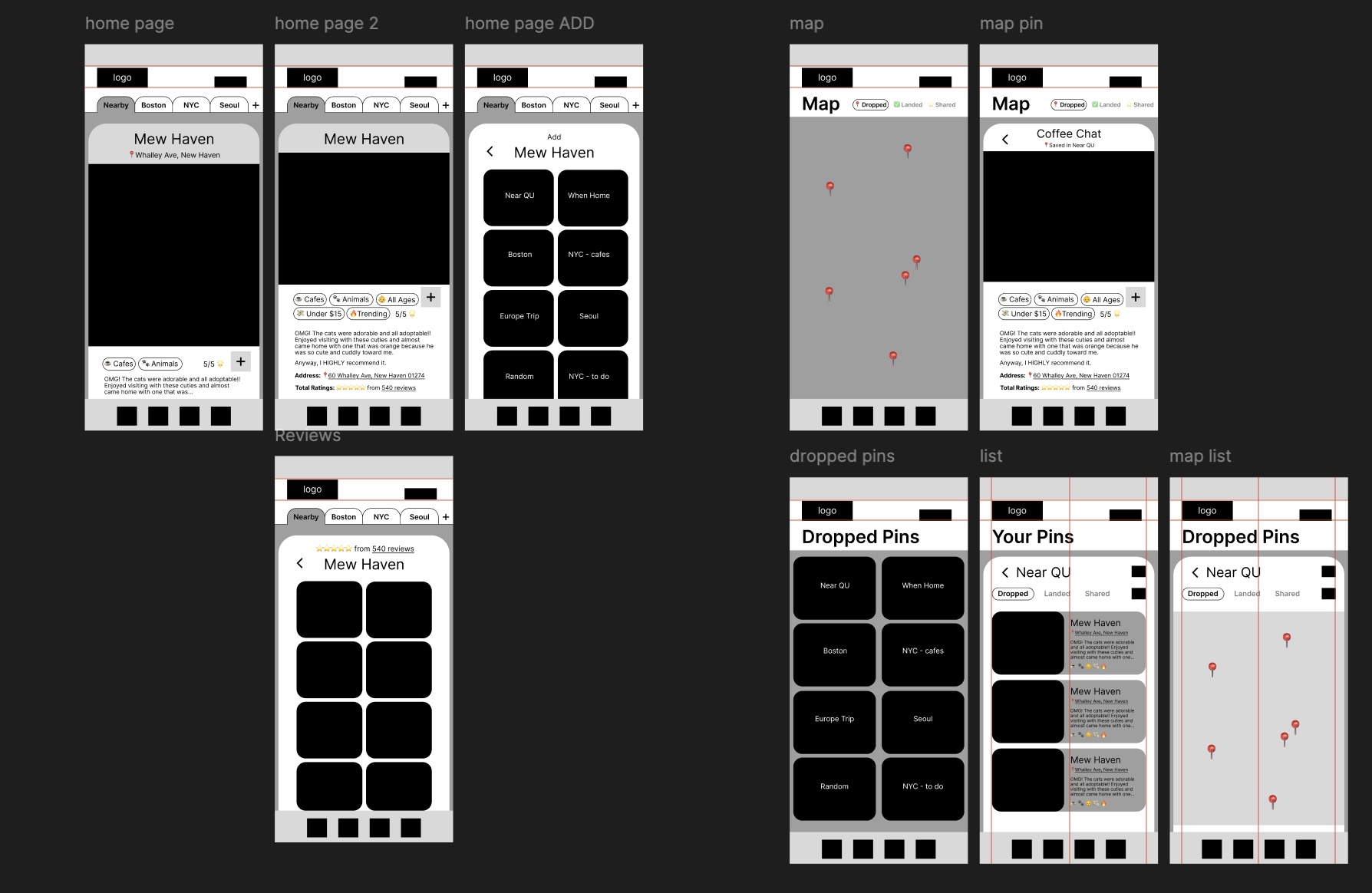
Drop A Pin's visual identity had to balance creative energy with navigational clarity, warm enough to feel personal, structured enough to feel trustworthy. I used Pinterest to collect inspiration.
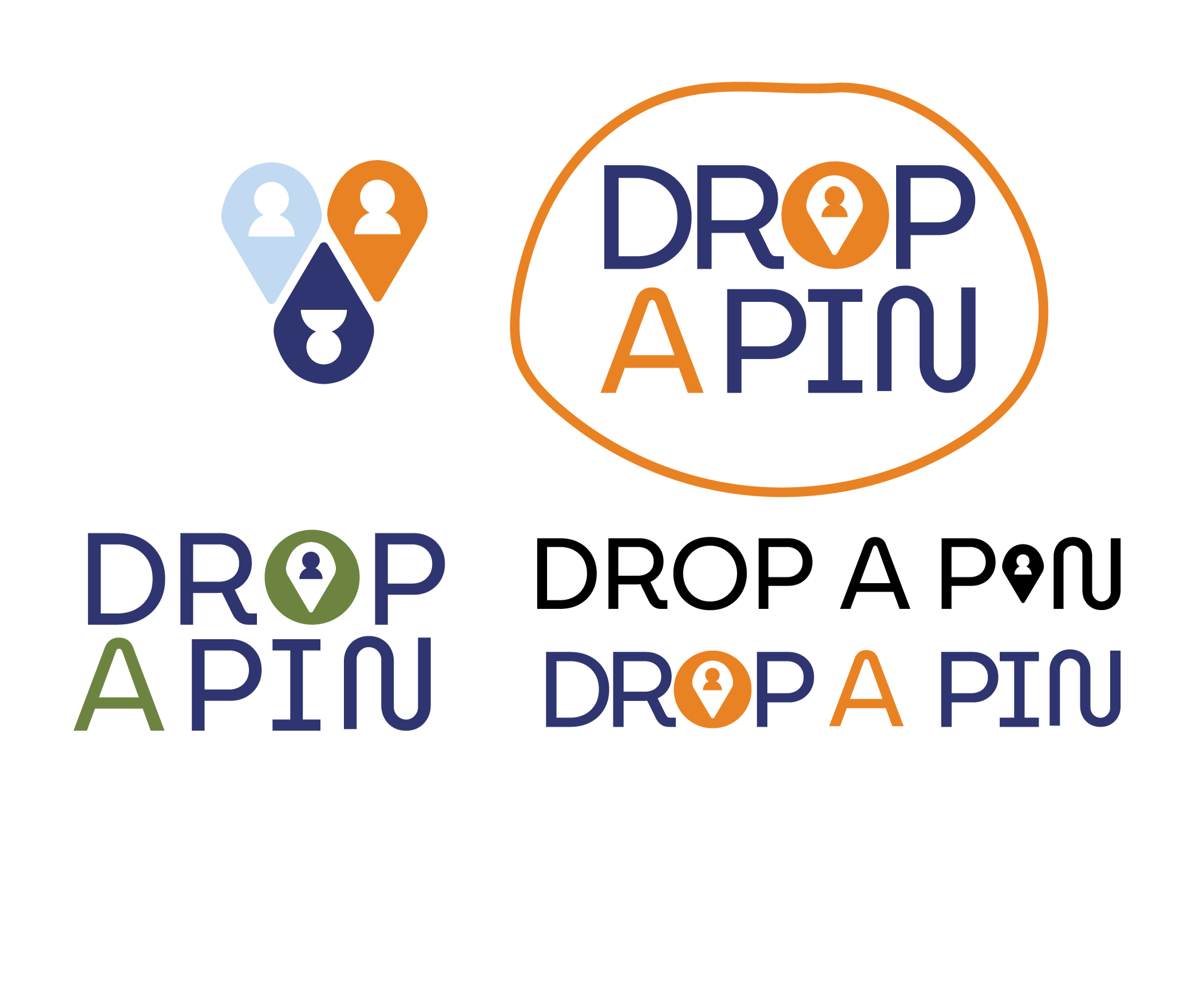
Logo: Developed through several hand sketches, digital iterations, and critique rounds. The final mark integrates a map pin form, directly reinforcing the core concept.
Color Palette: Narrowed from five colors to three through iteration and critique. Navy Blue for trust and clarity, Rust Orange for energy and creativity, Background Beige for warmth and balance.
Typography: Final choice includes MuseoModerno for headers, chosen for its friendly, inviting character. Estedad-VF for body text, built for mobile readability.
Brand Identity Development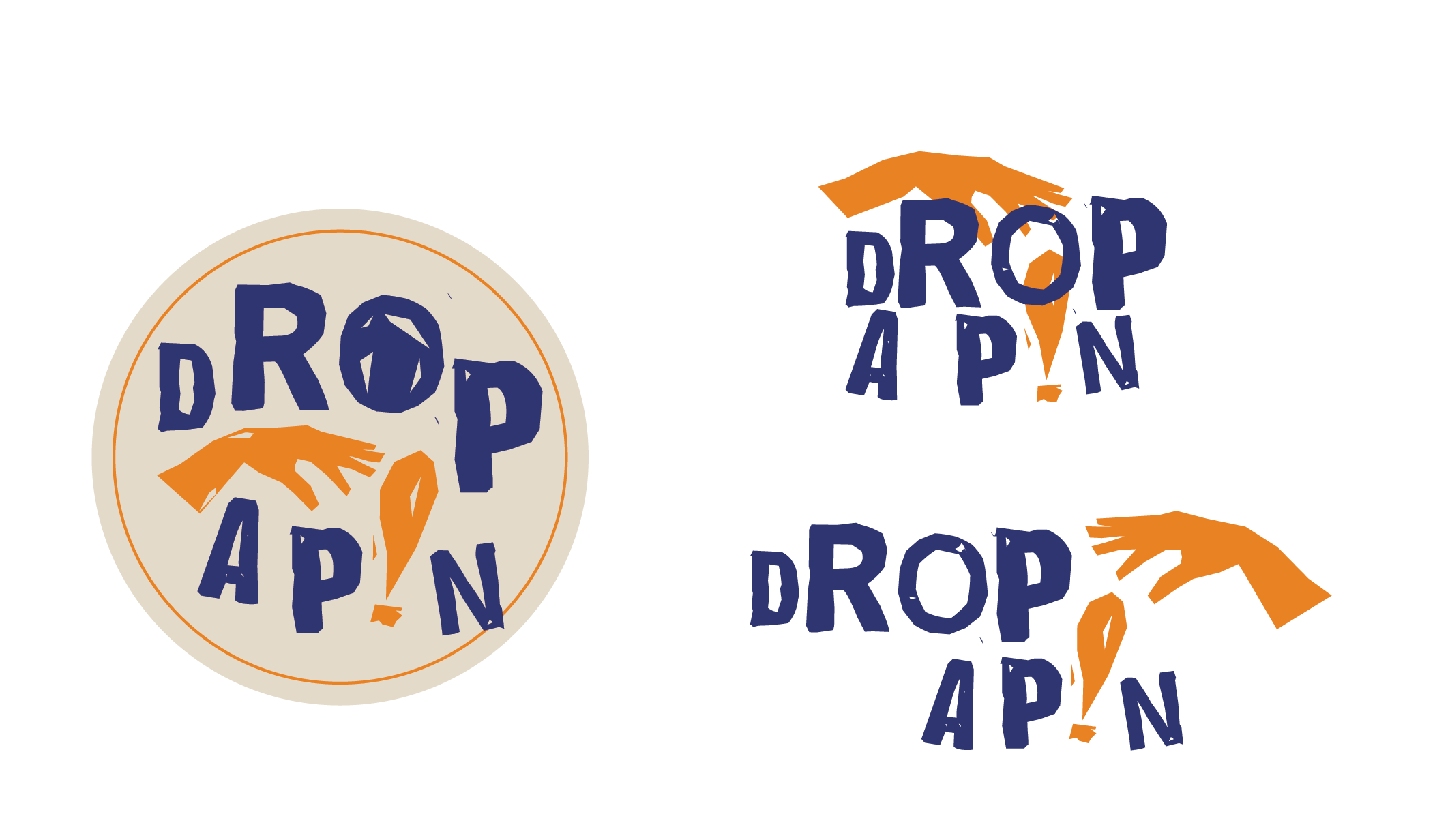

Information Architecture: Mapped five core screens in Mural: welcome, home feed, map, boards, and profile. Each was structured around specific user actions before a single frame was designed.
Wireframes: Low-fidelity sketches resolved layout and navigation structure early, so high-fidelity work moved with focus and confidence.
User Flows: Mapped key journeys including onboarding and saving a post, surfacing friction points before they became Figma problems.
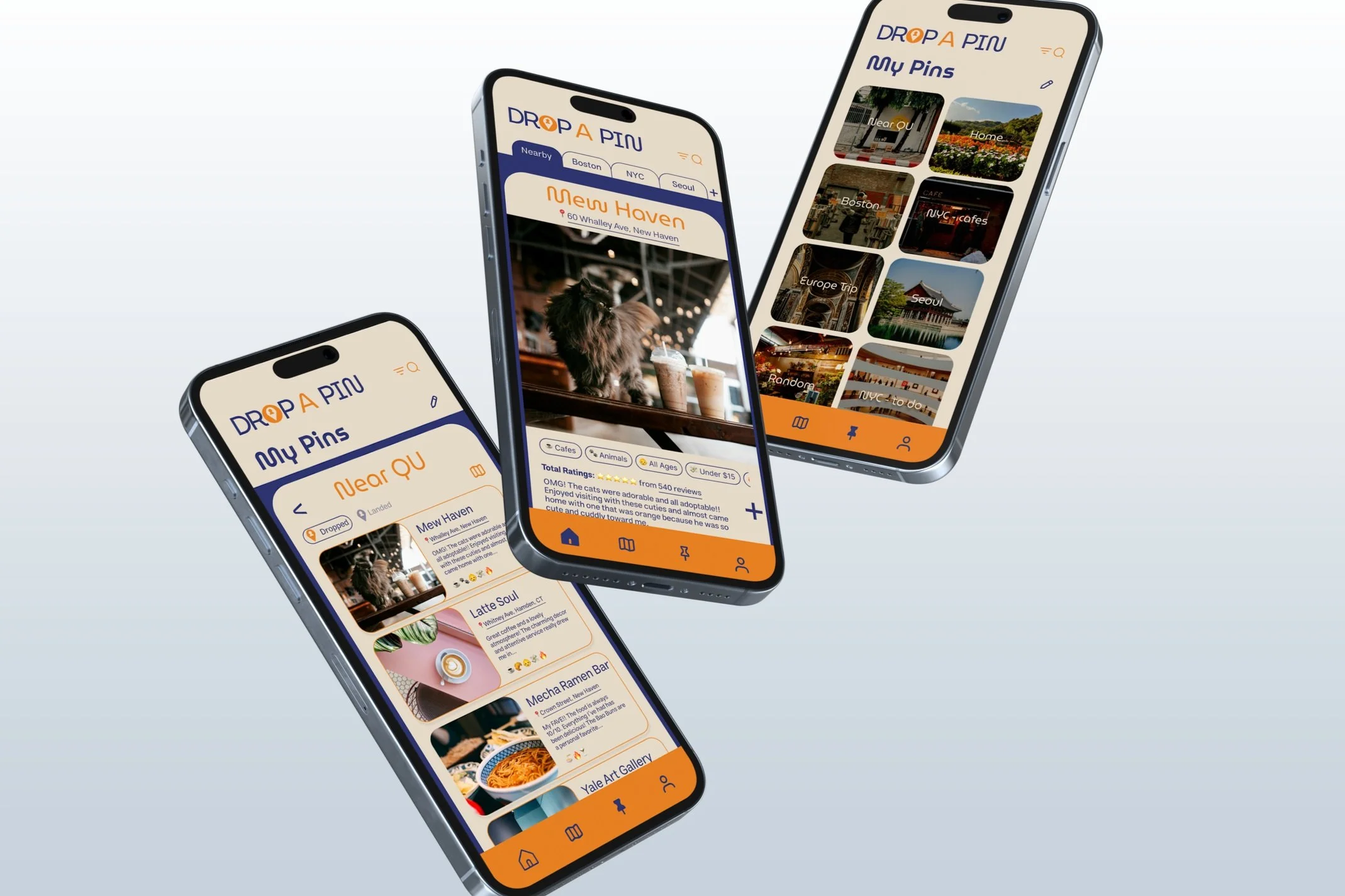
High-Fidelity Prototype: Full brand system applied across all five screens. Fully interactive.
UX/UI Design ProcessI analyzed four existing apps to find where Drop A Pin could own a differentiated position.
Google Maps: Strong for navigation, but saved places live in flat, impersonal lists with no visual appeal
Pinterest: Visually rich and inspiring, but has no geolocation or map functionality whatsoever
InspoMapr: Built for aesthetic browsing, but the UI feels cluttered and community features are thin
Mom n Pop: Focused on small business discovery, but reads like a directory, not a social platform
The gap was clear: no tool was visual-first, map-integrated, and community-driven at the same time. That positioning became the foundation for every design decision that followed.
Competitor AnalysisDrop A Pin delivers what the competitive landscape was missing: a visual-first interface, emotionally resonant curation tools, and a community layer that makes local discovery feel personal. Users can build boards of saved places, revisit favorites, plan trips, and share locations with people they trust, all within one cohesive, branded experience.
Deliverables
Fully interactive Figma prototype across all five core screens
Complete UI Kit: color system, icon set, and button states
User flows and user experience documentation
The Solution
As a concept project, success is measured by the strength and completeness of the system delivered.
Fully resolved brand identity developed from scratch across typography, color, and logo mark
Five-screen interactive prototype that proves the concept is functional, not just aesthetic
Clear competitive positioning strategy that identifies a real market gap and designs directly to it
Outcomes
Key Takeaways
Leading every stage of design from research through prototype sharpened my ability to make decisions with strategic rationale, not just creative instinct
Brand and UX are not separate disciplines. Every color, typeface, and interaction has to serve the same user and tell the same story
The most important design work happened before I opened Figma. Research is what made the final prototype feel cohesive