Speculative Digital Campaign for KCON
Role
Email Blast Designer ·
Instagram Content Creator


Timeline
Fall 2024
6 Weeks

Scope
Instagram · Email · Facebook · Adobe Illustrator
A conceptual multi-platform campaign designed to elevate KCON's digital presence across Instagram, email, and Facebook. Built to match the energy of global K-pop fandom with content that is bold, organized, and scroll-stopping.
KCON is one of the largest K-pop and Korean culture conventions in the world, with a fanbase that is passionate, digitally engaged, and highly visual. This speculative campaign explores what a more elevated, cohesive digital outreach strategy could look like across three key platforms.
As the Instagram and email lead, I designed a full suite of branded content built to inform fans, build pre-event excitement, and stay true to KCON's bold, energetic identity. I was apart of a two-person team, collaborating with motion and Facebook ad designer Allison Canahui.
Overview
KCON's existing digital presence had the energy fans expect, but the campaign needed a more intentional content system to match the scale of the event and the expectations of its audience. This project set out to:
Translate KCON's new branding into a consistent multi-platform digital content system
Communicate event information clearly without losing the brand's playful, high-energy tone
Design for a Gen Z audience that moves fast, skims first, and scrolls on anything that feels generic
Deliver assets across three distinct platforms while maintaining visual coherence throughout
Objectives
Process
KCON's audience is primarily Gen Z, ages 16 to 25, with a strong female-skewing demographic across the US and Asia. They are K-pop fans, K-drama watchers, and deeply engaged with fashion and beauty content. They live on social media and are used to brand experiences that feel exciting and community-driven.
This audience does not respond to content that feels corporate or overly polished in a disconnected way. They want brands to match their energy. Every design decision in this campaign, from the gradient-heavy color palette to the playful typographic choices, was made with that expectation in mind. The goal was content that felt native to the platforms they use every day, not like an ad being pushed at them.
Target AudienceWith research in hand, we mapped out three content categories to guide the campaign:
Informational: new locations, event tips, scheduling details
Promotional CTA: artist spotlights and announcements
Interest and Engagement: lineup previews, sneak peeks, countdowns
This framework kept us from designing in a vacuum. Every asset had a clear job to do within the campaign.
We also established an elevated visual identity for the campaign. While honoring KCON's existing brand energy, we pushed toward something more cohesive and system-ready. That meant defining a specific color palette (bright gradients, blue, yellow, pink, and green) and a deliberate type pairing: Erica One for headers (playful and bold) and Modica for body copy (modern and easy to read).
Content Strategy + PlanningDesign began with sketching and concept exploration before moving into Illustrator. The work was divided by platform: I owned Instagram and email, my partner handled Facebook ads and motion graphics. This split allowed us to move faster while maintaining consistency through our shared visual system.
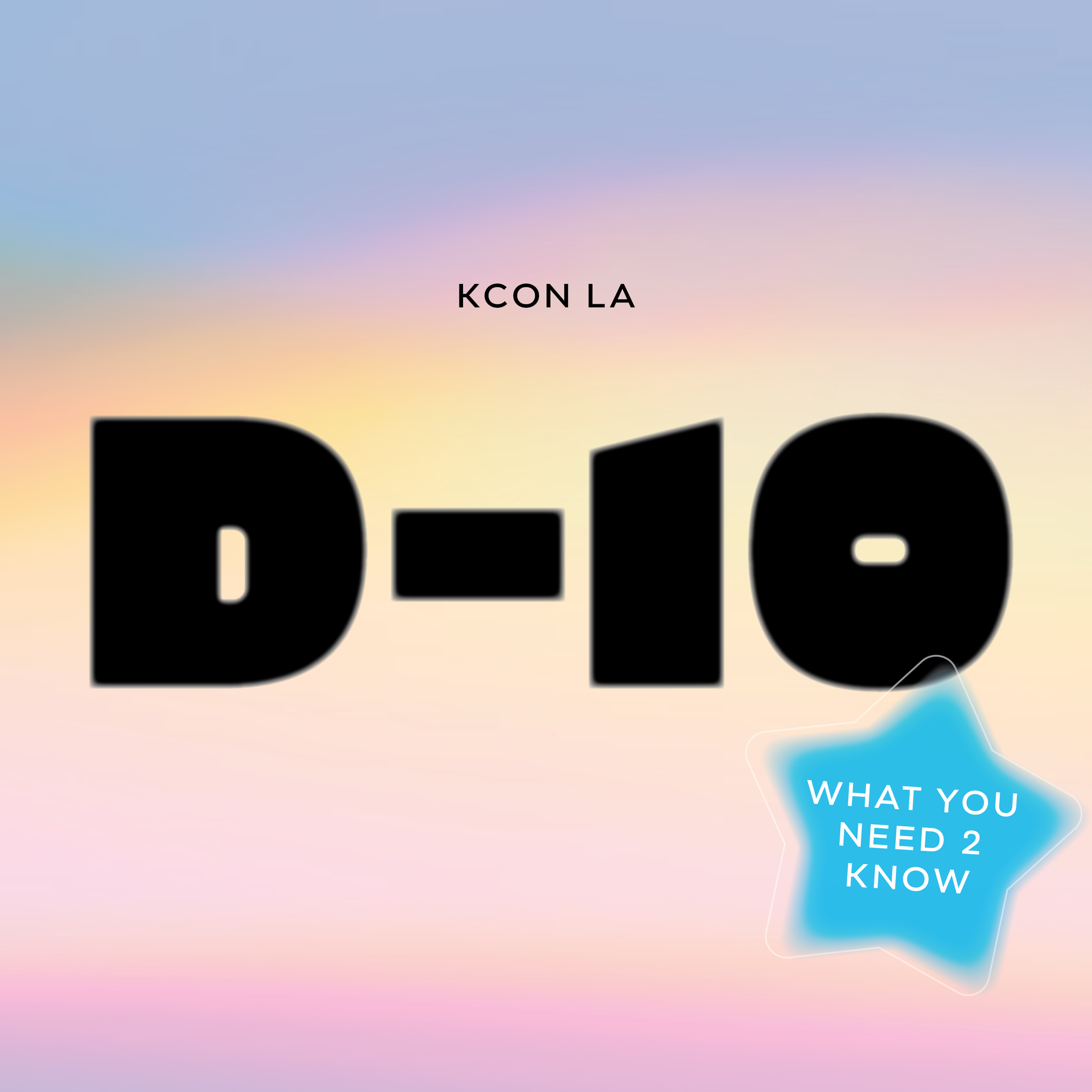
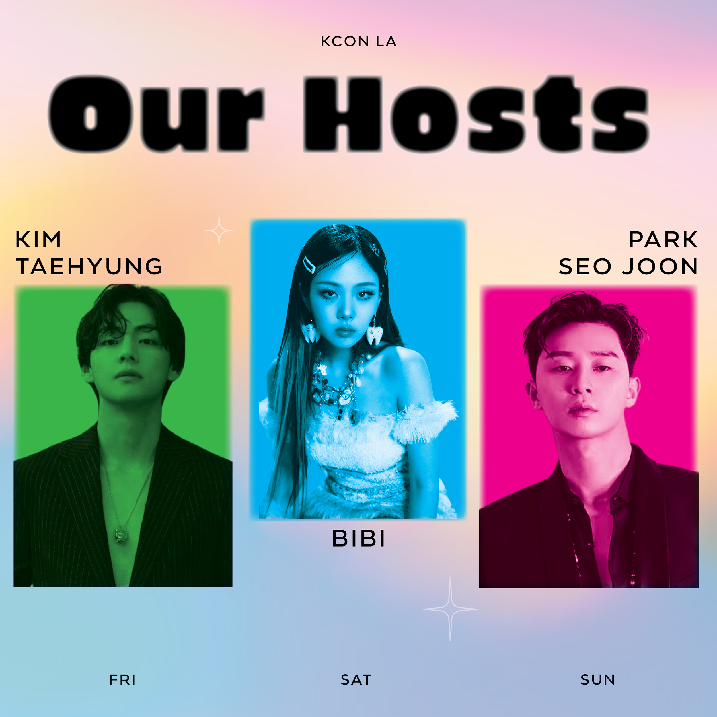
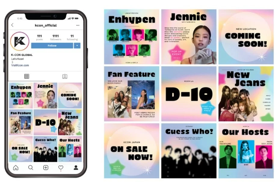
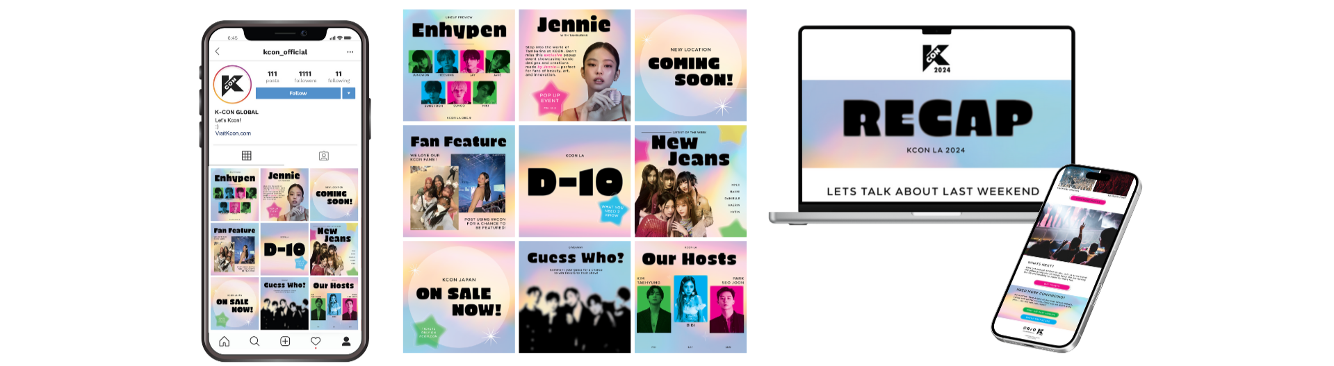
For Instagram, the goal was a versatile feed layout that could be easily updated across content types.
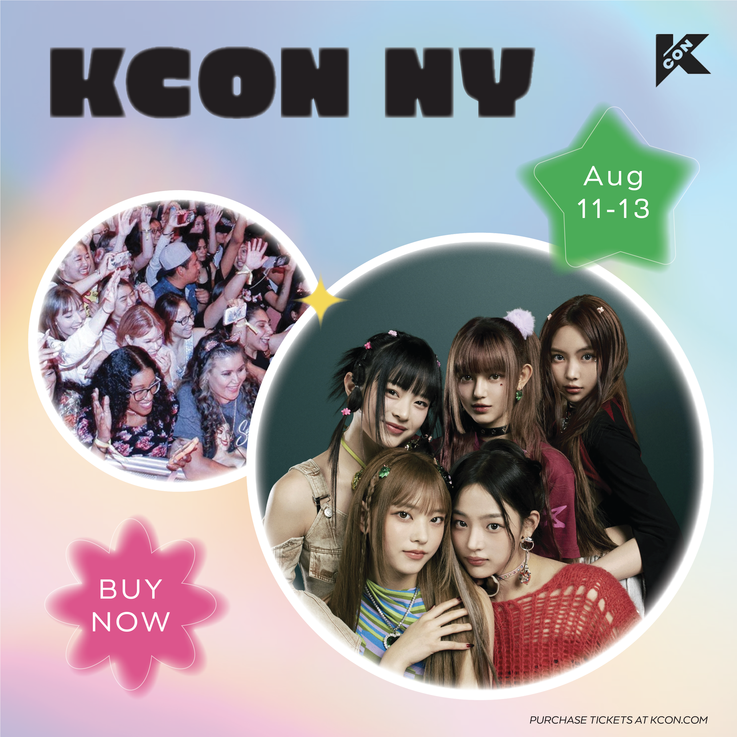
For email, I designed three targeted blasts each built around a specific CTA: launch, pre-event, and post-event.
Content Creation + Execution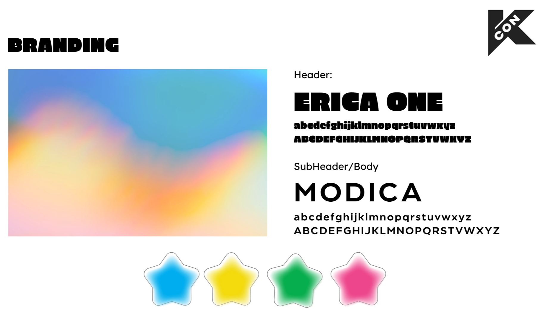
Before any design work began, we researched Gen Z digital behavior and best practices for event-based content. We also conducted a competitive analysis, looking at two of KCON's closest competitors:
K-Pop World Festival: South Korean-focused, colorful and information-forward
Asian Pop Festival: US and Korean audience, bright visuals with strong graphic impact
We also gathered visual references on Pinterest to align on layout, formatting, and the visual tone we wanted to bring to each platform. This research phase grounded every decision that followed.
Research + Insights
KCON needed a digital campaign that could hold up across platforms without losing its identity between them. The deliverables we built form a cohesive content system designed to meet fans where they already are.
Instagram feed posts and carousels: Visually consistent assets designed to scroll well, inform quickly, and encourage shares and saves
Email blast series (x3): Launch, pre-event, and post-event blasts each with a distinct CTA, cohesive KCON branding, and vibrant gradient layouts
Facebook ads: Clear, CTA-driven static graphics adapted for Facebook's layout and audience (designed by Allison Canahui)
Motion content: Animated teaser and promo assets for social channels to boost visibility and excitement (designed by Allison Canahui)
The Deliverables & System

This was a speculative project, so the impact lives in the strength and completeness of the system delivered. The campaign successfully addressed KCON's need for content that is platform-native, visually cohesive, and built around a specific audience, not just a general idea of "K-pop fans."
The work demonstrates what it looks like to take an existing brand and design within it intentionally, pushing the energy higher while keeping everything organized and functional.
Outcomes + Metrics
Designing for a multi-platform campaign means building a visual system first and individual assets second. Consistency across platforms only works if the foundation is established before execution begins.
Speculative projects require you to argue for every decision. Without a client to push back, the brief becomes your accountability partner. Researching the audience and competitors early made every creative call feel grounded.
Collaborating on a shared visual identity with a partner strengthened the output. Knowing where one person's work ended and the other's began, while keeping it looking like one campaign, was the real design challenge.
Key Takeaways