

Cetaphil Package Conceptual Redesign
Role
Package Designer
Cetaphil (Conceptual)


Timeline
Spring 2025
3 Weeks

Scope
Package Redesign · Adobe Illustrator · Adobe Photoshop
A concept redesign that modernizes Cetaphil's face wash packaging without losing the brand equity that makes it trusted. Three products, one refreshed visual system.
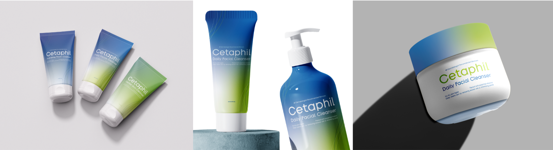
Cetaphil has long been a go-to in skincare, but its packaging tells a different story than the brand itself does. This concept redesign takes the face wash trio and reimagines the label system with a focus on warmth, clarity, and shelf appeal.
Keeping the original color palette and typography as a foundation, the redesign introduces improved layout structure, typographic hierarchy, and a background pattern that adds visual interest without competing with legibility.
Overview
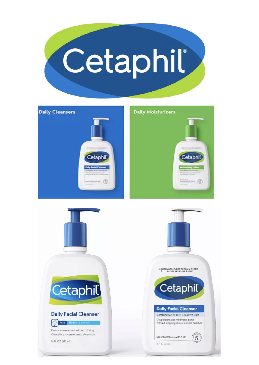
Cetaphil's existing packaging works functionally, but it reads as clinical in a category that has shifted toward approachable, expressive design. The redesign needed to close that gap while staying true to the brand.
Honor Cetaphil's established color palette and typography while introducing a more contemporary layout
Improve typographic hierarchy so key product information is easier to scan
Introduce a background pattern that adds warmth and personality without distracting from clarity
Deliver a system that feels cohesive across all three products in a collection
Objectives
Process

The first step was understanding where Cetaphil sits in the current skincare landscape. The goal was to identify what a modernized version of Cetaphil could look like without abandoning what makes it recognizable.
I built a Pinterest board focused on layout, typography, and pattern styles across the category, paying attention to the gap between how clinical brands tend to look and how more lifestyle-forward skincare brands present themselves.
Research + InsightsSketching let me work through how the key product information could be organized to improve readability and visual flow. I also used this stage to explore background pattern options, testing how different textures and motifs would interact with the text and the existing brand colors.
Translating the sketches into digital compositions meant testing a range of patterns, spacing systems, and typographic hierarchies. Multiple directions were explored at this stage before narrowing toward a cleaner, more restrained approach.
Ideation + Development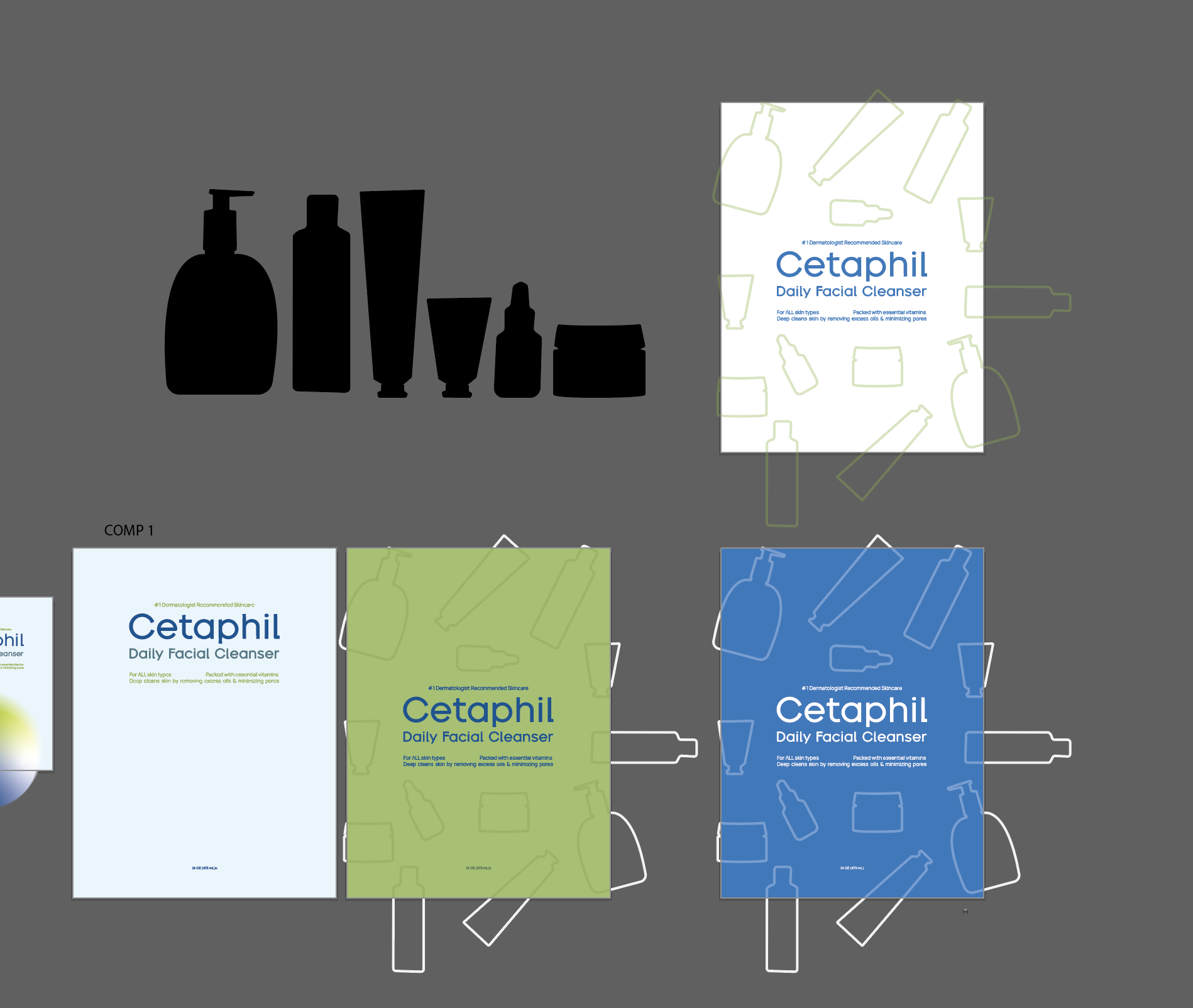
Critique from professors and peers pushed the design toward greater simplicity. The final background pattern is more minimal than earlier iterations, which ultimately made the packaging feel more modern and cohesive across the three-product system.
Feedback + Refinement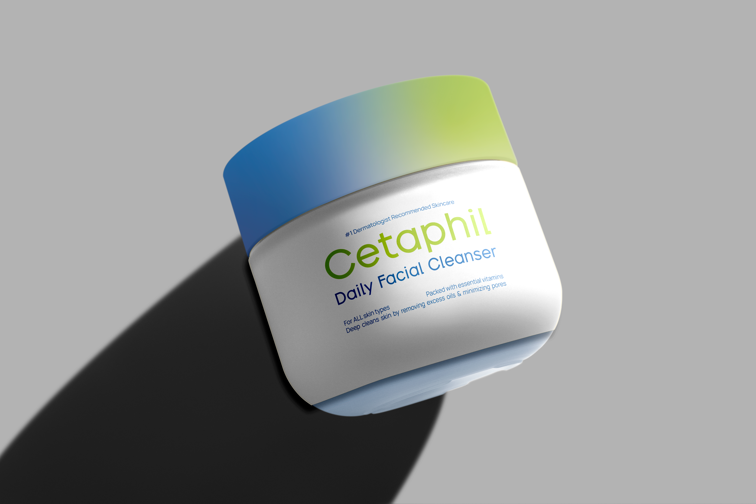
The final design system updates Cetaphil's face wash packaging with improved layout, cleaner typographic hierarchy, and a restrained background pattern that adds warmth while keeping the focus on the product and brand. The core color palette and typography remain intact, so the redesigned labels read as a natural evolution rather than a departure.
Deliverables include:
Front-facing label mockups for the full face wash trio
Updated label system designed to scale across product types
Visual system incorporating refined pattern, layout, and typographic rhythm
The Solution

This is a concept project, so outcomes are measured by the strength and completeness of the system rather than market performance. The final deliverables demonstrate a clear and intentional upgrade to the packaging: better hierarchy, a more inviting visual tone, and a label system that works consistently across products.
The redesign shows what Cetaphil's packaging could look like if the brand leaned into the warmth and approachability that already defines its reputation.
Outcomes + Metrics
Key Takeaways
Redesigning within brand constraints is a different kind of design challenge than building from scratch. Keeping the existing palette and typography forced every improvement to happen through layout and composition decisions, which sharpened those skills specifically.
Critique changed the direction of this project in a meaningful way. Earlier pattern iterations were too complex and competed with readability. Simplifying based on feedback produced a stronger result than the original direction would have.
Packaging design has to hold up at a distance before it earns a closer look. That shift in thinking about shelf presence changed how I approached hierarchy across the whole label system.