Lexend Type
Speciman Booklet
Role
Designer
Layout Artist


Timeline
Fall 2024
4 Weeks

Scope
Print Design · Typography ·
Editorial Layout
A clean, editorial print booklet showcasing an accessibility-first typeface through strategic typographic storytelling.
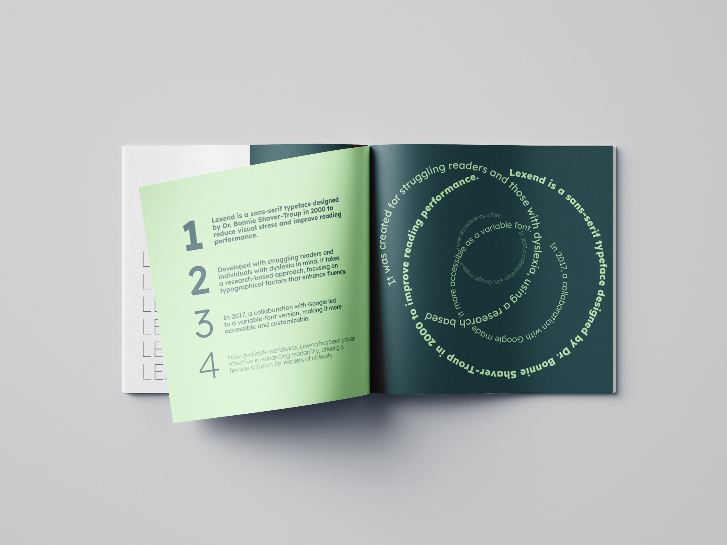
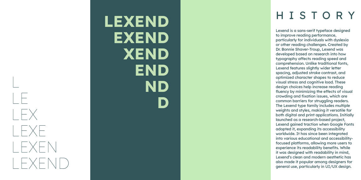
Lexend was designed by Dr. Bonnie Shaver-Troup to reduce visual stress and improve reading performance, especially for people with dyslexia. I wanted to build a type specimen that didn't just look aesthetic, but reflected the typeface's purpose: using the design itself as proof of Lexend's clarity, warmth, and versatility
Overview
Type specimen booklets often feel dry and technical with alphabet charts and font weight tables. The opportunity here was to make the form match the function: a booklet that is itself easy and simple, yet engaging to read.
Demonstrate Lexend's accessibility through intentional typographic layout
Establish a cohesive color and hierarchy system using only Lexend
Balance expressive editorial moments with functional clarity
Tell the story of the typeface alongside its visual capabilities
Objectives

Process
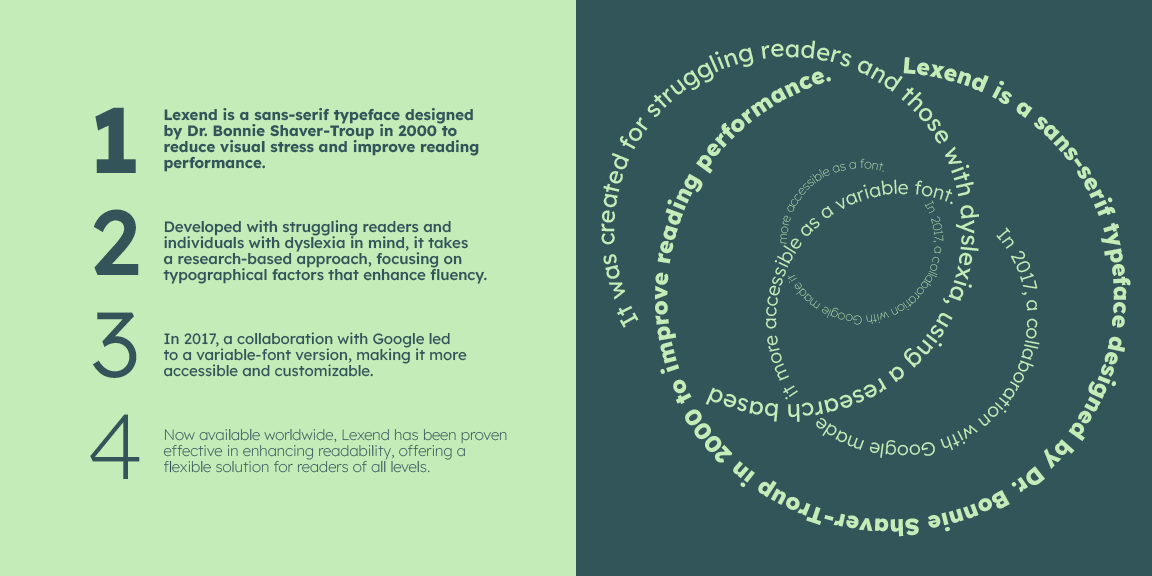
Studied the origin story of Lexend, including its development by Dr. Bonnie Shaver-Troup and Google Fonts integration, this context shaped every design decision
Curated a Pinterest board of editorial specimens, focusing on weight, repetition, and rhythm vs. decorative aesthetics
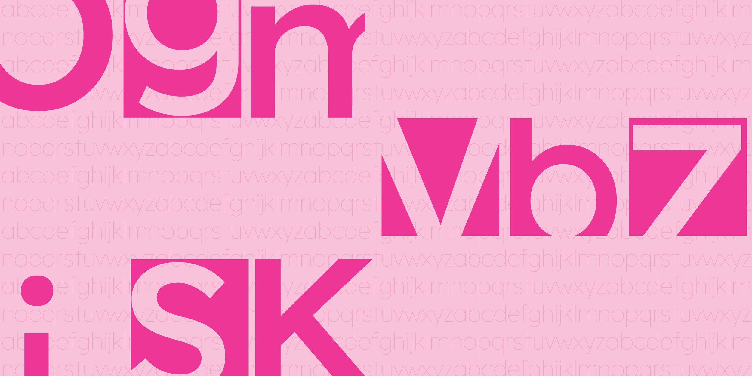
Identified that the most compelling specimens use the letterforms themselves as visual elements, not just text to be read
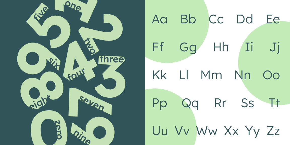
Research + InsightsI explored three color palettes: green, pink, and blue, before selecting a dark/light green duo with white for contrast.
Sketching focused on layout rhythm, large-scale letterform compositions, and finding the balance between expressive spreads and readable text.
IdeationThree distinct comps were developed and critiqued by professors and peers. Feedback focused on improving hierarchy, tightening spacing, and ensuring the green palette readings across different page densities.
Design Development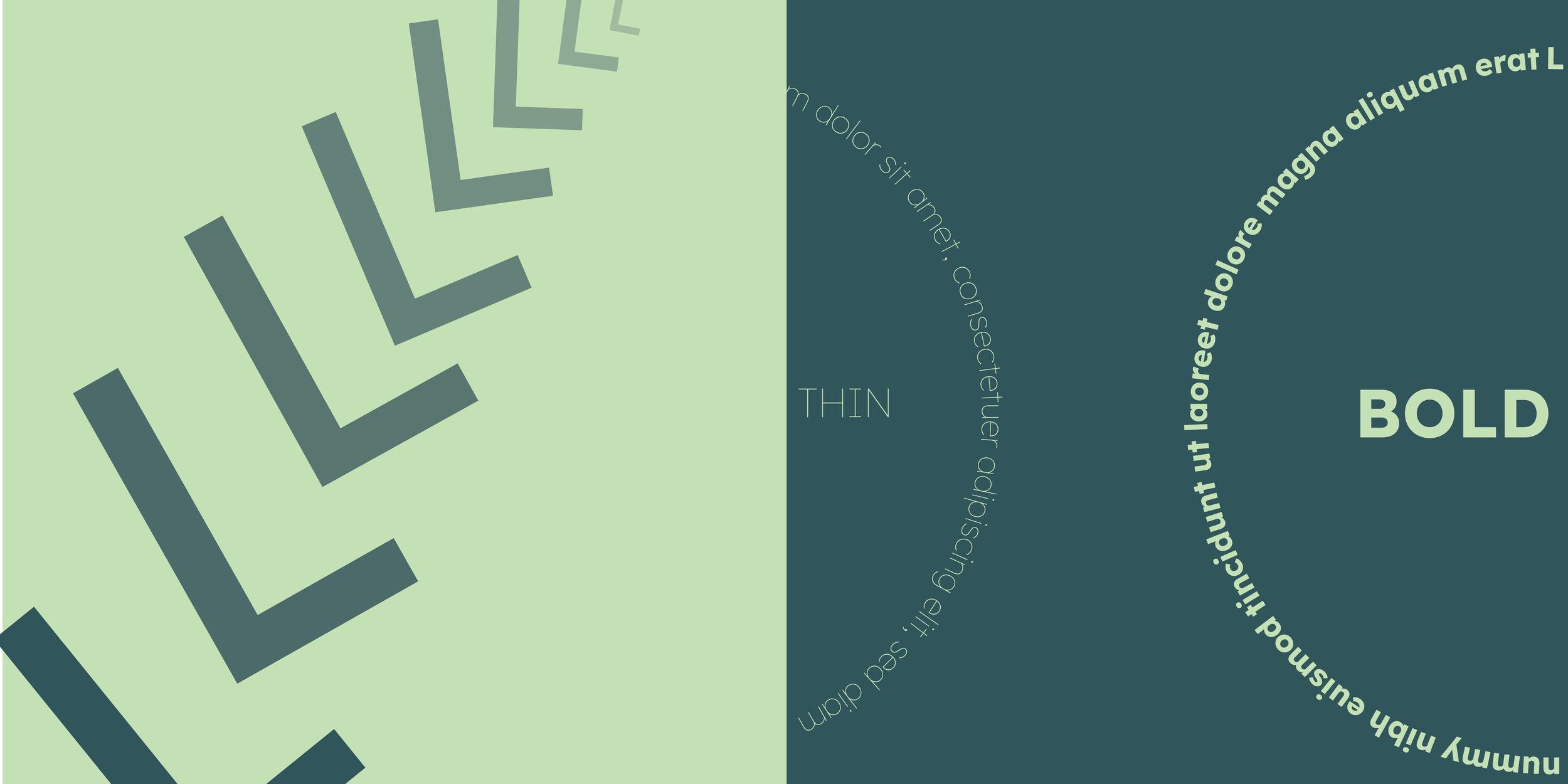

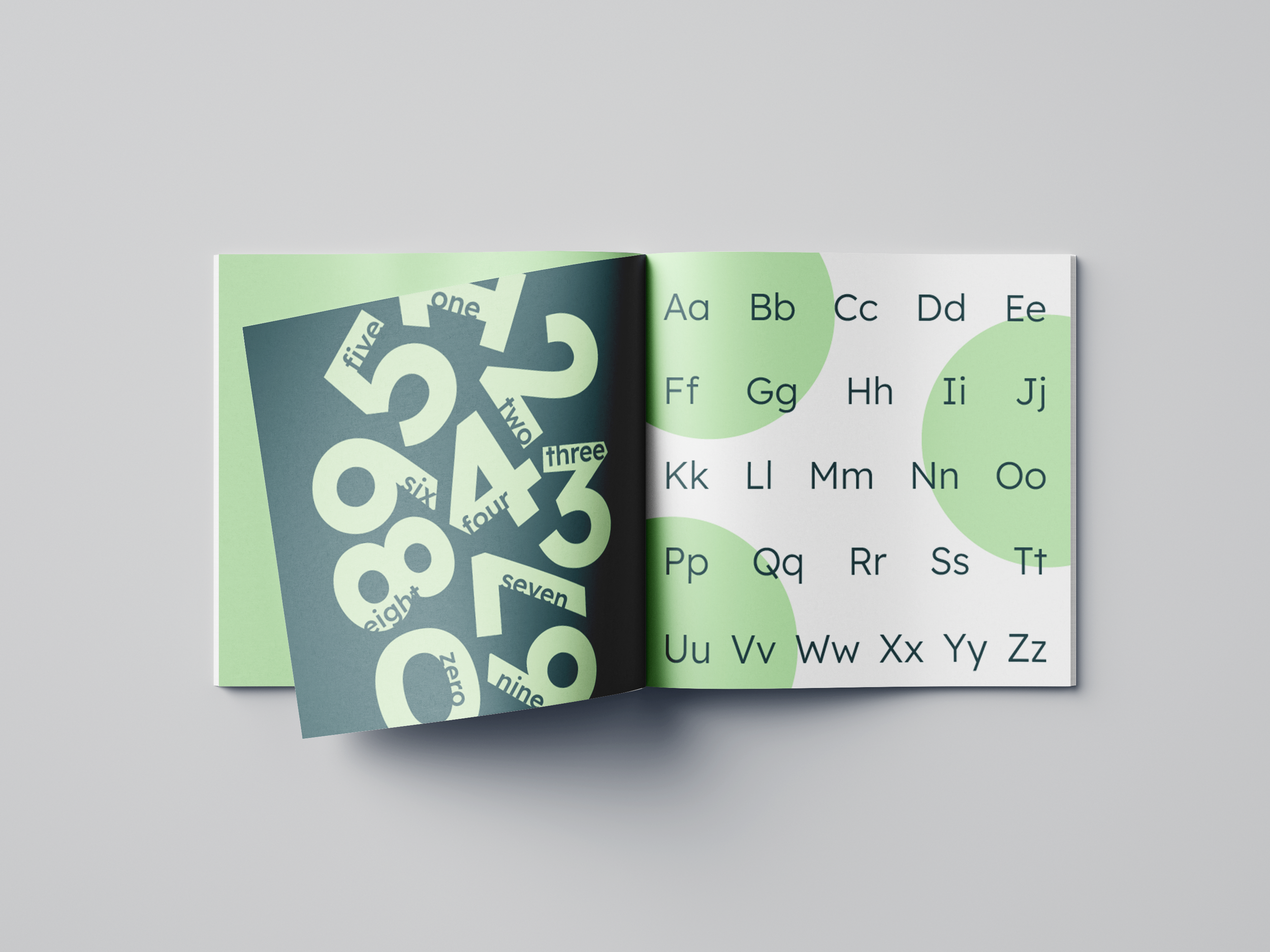
A 16-page editorial type specimen that functions as both a showcase and a story guiding the reader through Lexend's purpose, personality, and technical range.
The green palette creates a calm, focused reading environment that mirrors the typeface's accessibility mission. Using Lexend exclusively throughout proves the font's versatility without relying on contrast from other typefaces.
The Solution
The best type specimens use form as argument, every layout choice should demonstrate the typeface's values, not just display it
Designing with constraints (one typeface, two colors) sharpens creative thinking more than unlimited options
Understanding why a typeface was made changes how you use it. Purpose-driven design starts with research, not Illustrator