🏆 PRSA Mercury Award: Silver, Collateral (2025)
🏆 PRSA Mercury Award: Silver, Collateral (2025)
A cross-platform, white-label media kit designed to promote financial literacy on college campuses for the DebtWise App.
DebtWise Print & Email Promotion
Role: Lead Designer; Associate VP of Graphic Design
Teams: Content & Copy, Social Media, Graphic Design, and Photo & Video teams at The Agency at Quinnipiac
Client: DebtWise
Timeline: 12 Weeks (2024)
Tools: Adobe Illustrator, Photoshop, Canva
DebtWise, a financial literacy and debt management app, partnered with The Agency at Quinnipiac to expand its presence in higher education through a white-label solution. As the Lead Designer, I focused on developing adaptable flyers, a multi-page informational pamphlet, and branded social content tailored to university audiences, all while preserving DebtWise’s mission.
These deliverables were part of a larger media kit that also included web and social copy, an FAQ sheet, a landing page, and a promotional video, developed in collaboration with the Content & Copy, Social Media, and Photo & Video teams. The final kit promotes financial wellness among college students and gives DebtWise a scalable, branded system for future campus partnerships.
Summary
DebtWise had recently rebranded and was looking to expand its platform into the university space through white-label partnerships. While their app provides essential tools and resources for financial literacy, they lacked a cohesive visual system to promote these features in a way that resonated with college students. Their biggest challenge was reaching and engaging a student audience that is often overwhelmed with financial decisions, including student loans, credit building, and budgeting.
They also needed a marketing system that could be easily adapted to match each university’s branding, while still reinforcing DebtWise’s overall identity. At the time, they had no existing templates or promotional assets, making it difficult to roll out consistent messaging across multiple campuses.
The Problem
Our Objectives
Increasing awareness among college students through relevant, engaging messaging
Building a versatile system of materials that could be customized for various university partners
Translating financial concepts into visuals that students would actually connect with
Establishing DebtWise as a trusted and credible tool for financial education
Driving app downloads through clear and effective calls to action
Before design began, we conducted research to understand:
Key features and differentiators of the DebtWise platform
Best practices for communicating financial topics visually
University brand guidelines, focusing initially on the University of Nevada, Reno
The design preferences and digital behaviors of Gen Z students
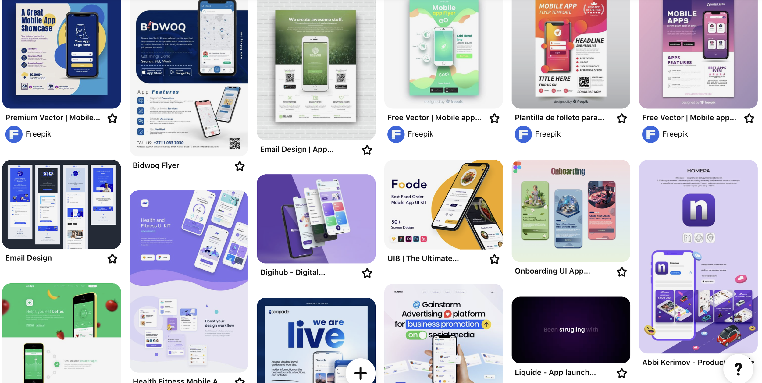
We also pulled design references from platforms like Pinterest to spark layout and formatting ideas.
Discovery & Research
We began with a range of flyer concepts, falling into two core styles:
Information-rich designs for areas where students might stop and read more details
Visually rich flyers for high-traffic locations for quick, eye-catching messaging
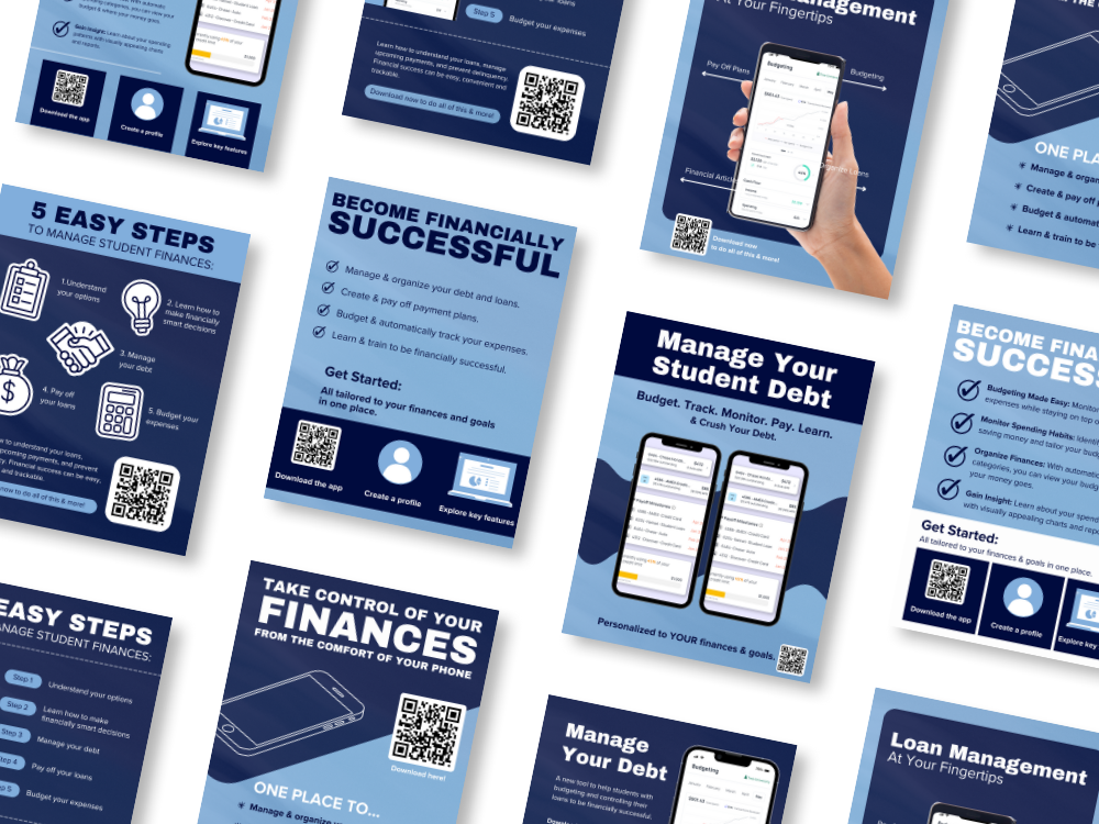
One of our biggest design challenges was presenting dense financial content in a way that still felt engaging. We leaned into visuals of phones and the app interface as something students could recognize and relate to.
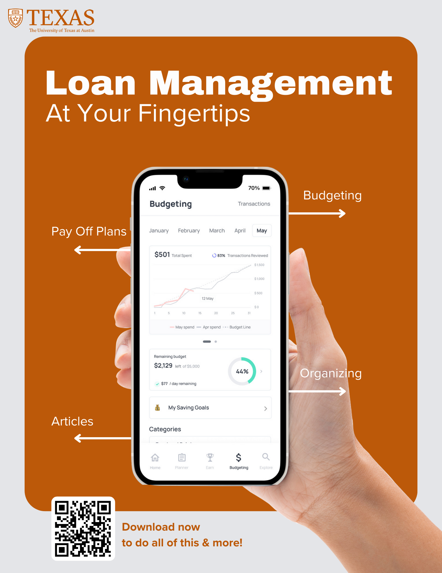
During critique sessions, a recurring piece of feedback was that the materials felt too tied to a single university. In response, we expanded the design system by creating mockups for additional universities. This helped the client better visualize how the white-label approach would scale and how each set could feel unique while maintaining a cohesive look.
We also struggled to fit all of the content DebtWise wanted into the flyers. That limitation led to the creation of an informational pamphlet that could carry more in-depth content without overwhelming the viewer.
Ideation & Exploration
-

Promotional Flyers
Developed multiple flyer styles in both info-rich and visual-first formats
Created adaptable layouts that could highlight different features of the app
Built a responsive color system to reflect four distinct university brand palettes
-

Informational Pamphlet
Designed as a companion to the flyers, offering a deeper look at the platform
Balanced content density with white space and clean hierarchy
Included thoughtful structuring to help students navigate complex topics easily
-

Email Templates
Collaborated closely with the Content & Copy team
Designed flexible headers and footers customized for each university
Due to limited access to visual assets, I reworked and modified available images in Photoshop to align with the platform’s look and feel
Focused on clear CTA placement to drive app downloads
-

Master Templates
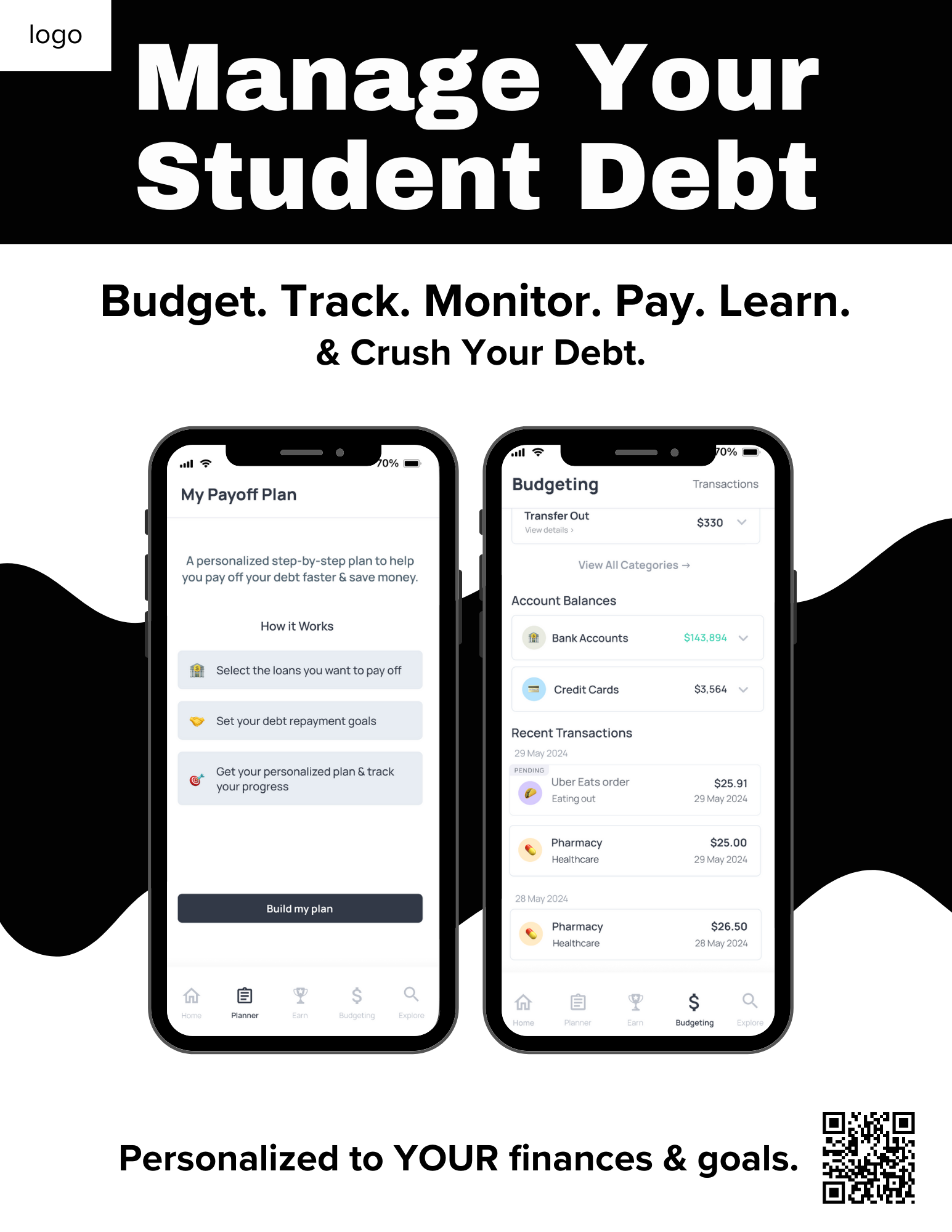
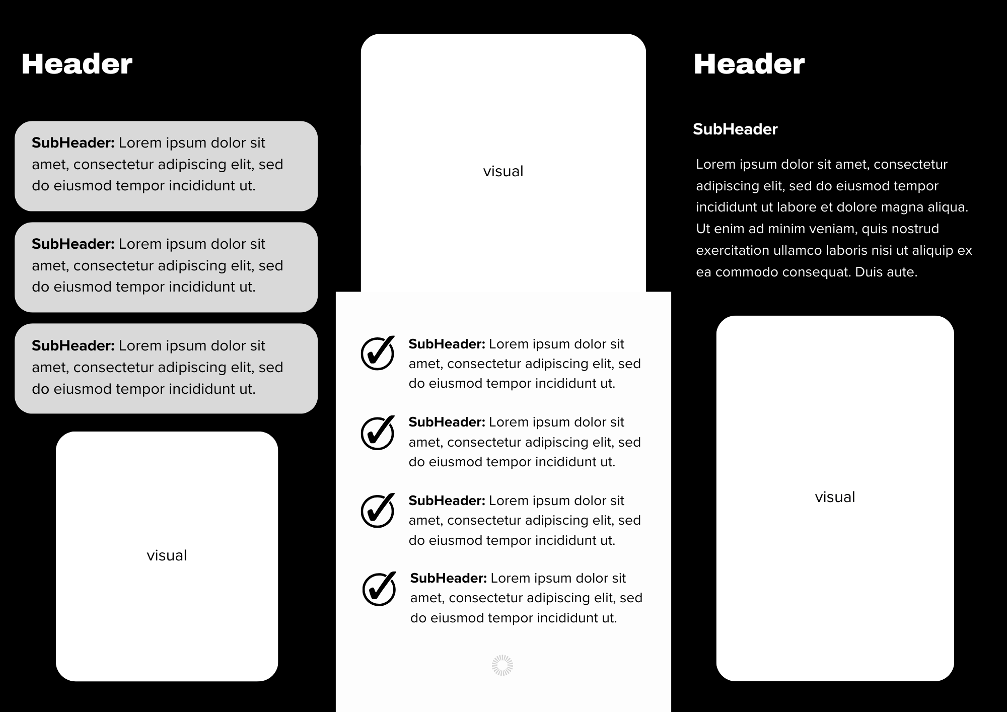
Developed universal black-and-white templates with editable regions
Equipped the client with a scalable design system for future university partnerships
Provided documentation to guide in-house customization while preserving consistency
The final deliverables included a cohesive, flexible media kit built for white-label use across universities.
This kit featured:
University-branded flyer collections (4 sets)
A multi-page informational pamphlet
Email templates built for financial aid offices
Master design templates and guidelines for scalable implementation
Each piece was crafted to support both physical and digital outreach, helping DebtWise communicate clearly with students while aligning with varied institutional brand standards.
The Deliverables
Flyers:
Pamphlets:
Key Takeaways
DebtWise now has a ready-to-use media kit that can be quickly adapted and rolled out across current and future university partnerships
Created a system that can scale without needing to redesign for each new partner
Strengthened trust and credibility with student audiences through consistent messaging and visuals
Enhanced app visibility and download potential through targeted marketing assets
Client expressed how helpful the final materials were, especially in showcasing adaptability across schools
Impact & Outcomes
Designing for white-label use requires flexibility without sacrificing clarity
Balancing multiple brand systems in one cohesive design system is a (challenging) creative opportunity
Flyers have limitations, and recognizing when to shift to a more detailed format like a pamphlet can make communication more effective
Strategic critiques helped us refine and scale the work in a more thoughtful direction
Even with limited visual assets, I found creative solutions using Photoshop to rework and modify imagery in a way that remained professional and aligned with the brand

