

Postcards from Korea
A design-driven travel blog and digital toolkit for students, specifically going to South Korea.
Role: Visual & Web Designer; Entrepreneur
Project Type: Digital Product Design, Web Design, Content Strategy, Digital Marketing
Timeline: 12 weeks (2025)
Tools: Mural, Figma, Wix, Adobe InDesign, Illustrator, Canva, Google Docs & Sheets, Gumroad
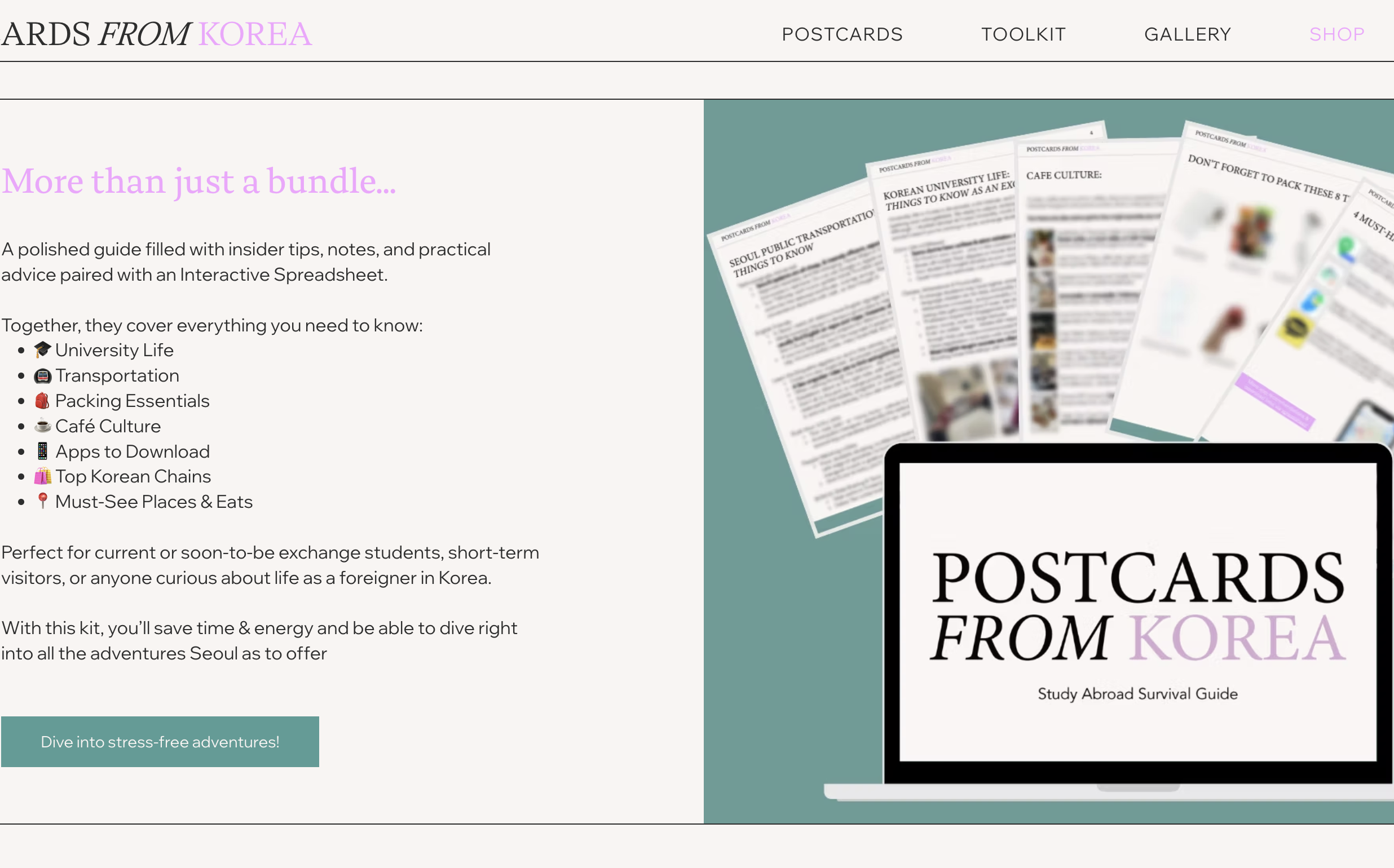
The Study Abroad in Korea Survival Kit is a two-part digital product created to help students and first-time travelers prepare for life in Korea.
It combines a polished PDF guide with an interactive Google Sheet to deliver both visual clarity and practical organization.
Built from my own semester abroad experience in Seoul, this product bridges storytelling and strategy, transforming real experience into a marketable digital resource that blends design, culture, and usability.
Additionally, this product is part of my Postcards from Korea brand that began with as website blog, further laying the foundation for the tone, visuals, and voice that carried into this digital product.
Summary
Before developing the digital product, I created the website which blends personal storytelling, photography, and design to capture the experience of studying abroad in Seoul.
This website established the visual direction for everything that followed, from typography and color palette to the friendly, reflective tone used across the Survival Kit.
This mood board captures the blog's visual identity, aiming to blend personal, diary-like storytelling with fun layered layout choices.
Typography: Thermal (headers) + avenir (body) for readability and warmth.
Color Palette: Soft neutrals with pink and green/blue accents staying approachable and calm.
Visuals: Real photos from my study abroad experience
Brand Identity
The site’s creation followed a multi-stage design process, beginning with sketches and evolving into a fully responsive website.
I prioritized a blend of functionality and visual storytelling aiming for a user experience that felt warm, intentional, and reflective of real student life in Seoul.
The site established the tone & identity that later informed the Study Abroad in Korea Survival Kit. It became both the home base and inspiration for expanding the brand into interactive, digital products.
Goals
Create a narrative-driven travel blog with a custom Wix homepage featuring personalized layered imagery
Build an interactive platform that organizes content through dual blog categories: Postcards & Toolkit to separate personal stories from travel guides
Develop a cohesive visual identity supported by a responsive, mobile-friendly layout refined through iterative testing for accessibility across all devices.
Web Development
Website Design Process
-

Sketches
I began with hand-drawn sketches exploring page hierarchy and the “digital postcard” concept. Early moodboards captured the nostalgic, diary-like feel I wanted the brand to evoke.
-

Mural Planning
This sitemap outlines the planned structure to blend all the aspects of creative storytelling from my semester abroad in South Korea. Each page guides users through my visual journey in an engaging experience.
-

Figma Wireframes
Using Figma, I built low-fidelity wireframes to define the structure and navigation for desktop and mobile layouts. This helped plan user flow between the Postcards and Toolkit sections.
-

Wix Design
I transitioned the site to Wix, giving me full control over visuals, and layout. The final version features layered imagery, subtle animation, and cohesive branding consistent with the Survival Kit’s design system.
Building on the foundation and branding from my website, I began researching ways to expand Postcards from Korea into a digital product that offered real value to travelers and students.
On Etsy and Gumroad, digital products showed showed consistent demand, but products often lacked interactivity and student authenticity.
In reviewing similar Korea travel guides, I noticed:
Most were static PDFs without clickable links or maps.
Some were overly broad (covering entire countries generically) while others were too specific (limited to a single city).
Few spoke directly to the student traveler experience.
This created an opportunity to build a balanced, interactive toolkit to be practical, but broad enough to support diverse study-abroad scenarios.
Market & Competitor Research
Strategic Insights
Through informal peer feedback and personal reflection, I confirmed that my lived experience in Seoul gave me a competitive advantage. Students expressed frustration with scattered online info and wanted a single resource that combined credible advice, maps, and practical tools.
My research also validated the potential for modular design, where users could purchase a core bundle and later add-on mini-guides (for topics like etiquette, budgeting, or local cafés). This modular structure would create both versatility for users and scalability for the product brand.
From this, I defined my initial MVP framework:
PDF Guide: visually engaging, story-based overview
Interactive Sheet: deep-dive planning hub with links, notes, and checklists
This dual format balanced quick inspiration with actionable detail, transforming a static guide into a layered, interactive experience.
Students heading to South Korea for study abroad often struggle to find trustworthy, organized, and aesthetically designed resources.
Existing online advice is scattered across blogs, TikToks, and Reddit threads which are often repetitive, outdated, or overwhelming.
Key pain points identified:
“I’m overwhelmed trying to find what actually matters before I leave. I feel unprepared.”
“There is so many different opinions online. Who can I trust?”
The challenge was to design one cohesive toolkit that feels professional, practical, and personal to solve confusion through structure and clarity.
The Challenge
Create a design-driven, credible resource tailored for students traveling to South Korea
Build a dual-format system (PDF guide + interactive Sheet) to balance clarity and depth
Establish a clear, affordable price point ($5) that builds credibility and accessibility
Prepare for future scalability through blog, email, and social media integration
As the designer and strategist, I oversaw end-to-end product creation, from research and validation to design, packaging, and launch execution.
Objectives
After establishing my product direction, I entered the content-building phase, where the focus shifted from research and ideation to writing, organizing, and structuring the Kit’s core material.
This phase bridged the creative writing from my website’s Toolkit posts into a structured, product-ready format, ensuring consistency across both web and digital product experiences.
Using Google Docs as my primary workspace, I drafted and refined the major sections that would later shape the final PDF and interactive Sheet.
This phase helped transform my concept into tangible content. I referenced earlier blog posts from Postcards from Korea as a foundation, rewriting and expanding them for clarity, while adding new sections and localized insights that didn’t exist on my blog.
I afaced challenges with Naver Maps, which wasn’t intuitive in English. Although I was planning to create an in-app playlist of places to visit, I had to pivot to create a link map collection inside the future spreadsheet, blending utility with interactivity.
Content Building
Then, I moved into design execution, transforming my messy Google Docs into a cohesive visual system inside InDesign.
My goal was to create something that felt both educational and inviting, like getting advice from a friend who’s already lived in Seoul.
Keeping the brand identity in mind, I started with sketches to brainstorm layout ideas, then moved into indesign. I created master pages and paragraph styles to ensured structure and polish.
In order to create an interactive seamless experience, I added Hyperlinked CTAs throughout the PDF connect to the Google Sheet which has individual tabs.
Design Process
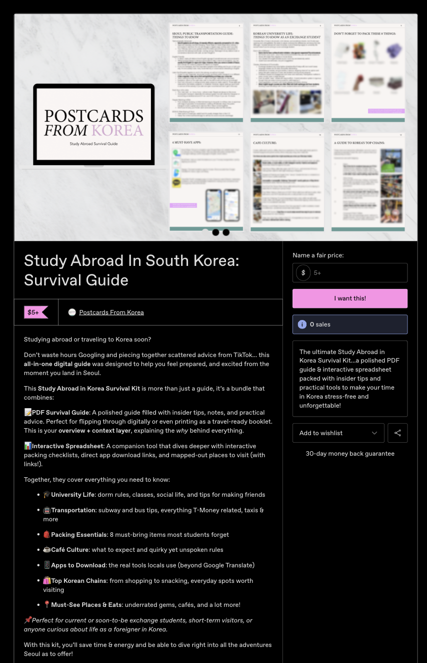
In Week 3, I compared Ko-fi and Gumroad as delivery platforms. Gumroad’s discovery page and streamlined checkout made it the clear choice.
I designed a branded storefront featuring:
Cover graphics and gallery mockups (Canva + Illustrator)
Short and long product descriptions
“What’s Inside” bullets and friendly CTA copy
Final pricing was set at $5, aligning with my positioning goal: accessible for students, credible for value.
Platform & Packaging
With the product designed and packaged, I moved into launch strategy. My focus was to create a simple but cohesive multi-channel funnel built around my existing Postcards from Korea audience.
Target Audience
Study-abroad students (ages 18–25)
First-time travelers to Korea
Parents and mentors seeking reliable student resources
Key Message: Built from real experience studying in Seoul. Practical, polished, and personal.
Marketing & Launch
Marketing Touchpoints
-

Blog Posts
Added CTAs at the end of related posts linking to the Gumroad Listing
-
Shop Page
On the official PFK blog site, added a direct link to my Gumroad shop.
-
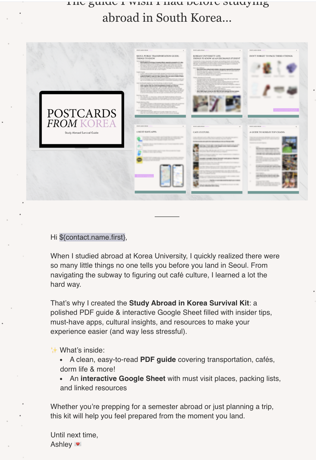
Email Blast
Launch email highlighting guide features and value as well as a personal message!
-

Facebook Group Posts
Friendly, helpful announcement post with visuals in Korea Specific groups
Timeline
Pre-Launch: Upload product, finalize mockups, draft posts.
Launch Day: Publish blog CTAs, send email, share in Facebook groups.
Post-Launch: Monitor Gumroad analytics, collect peer feedback, and test extended social media (Instagram/ TikTok).
Assets Created
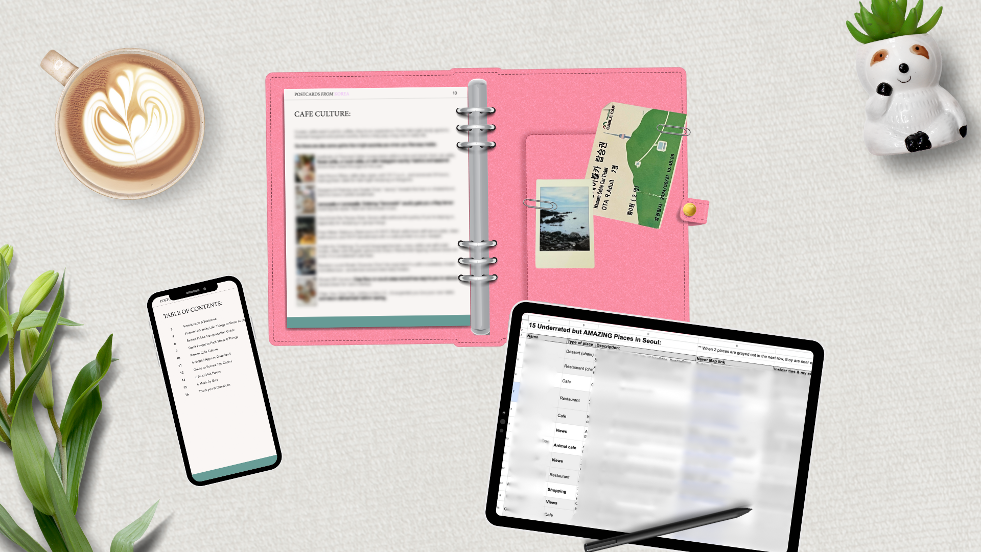
Branded product mockups (PDF + Sheet)
Launch email graphics and copy
Blog buttons and CTA banners
Facebook promo visuals
This multi-platform strategy built early credibility while keeping the launch scope realistic for a solo designer.
Launching Strategy
The Study Abroad in Korea Survival Kit is a fully packaged MVP: designed, marketed, and ready for sale on Gumroad.
Deliverables Completed:
Interactive two-part product (PDF + Sheet)
Branded Gumroad storefront with visuals and copy
Integrated marketing funnel (blog to storefront)
Outcomes:
Finished and published MVP
Positive feedback on clarity, design polish, and authenticity
Built framework for future product line expansion (city-specific or niche add-ons)
The Solution
This project brought together everything I love about design strategy, storytelling, and creativity.
It taught me how to take an idea from personal experience and through research, prototyping and visual design, turning it into real-world launched product.
What began as a website grew into a multi-platform brand ecosystem, combining blog storytelling, digital product design, and marketing strategy under one identity.
The process also reignited my passion for digital entrepreneurship and content marketing, and I am excited to keep expanding my Postcards From Korea brand.
The Study Abroad in Korea Survival Kit marks the first product in the Postcards from Korea brand, laying the groundwork for future micro-guides, social media content, and expanded travel resources.
Impact:
Planning and outlining before creation saved time and guided smarter design decisions
Cohesive branding elevated the perceived value & credibility
One well-designed yet simple resource felt more impactful than an overloaded planner
Marketing is storytelling through authentic personal context to build stronger engagement
What’s Next:
Create bundles or tiers to explore whether users want optional add-ons like city-specific mini-guides
Expand on social media (instagram, Tiktok)