

Cafe Physical & Digital Redesign
Enhancing Pound Coffee’s cafe experience through integrated spatial, interior & digital interactive design.
Role: Spatial & Web Designer
Project Type: Concept Re-Design & Re-Development
Timeline: 7 weeks (2024)
Tools: Canva, Coohom, Figma, Pinterest


Pound Coffee is a popular cafe among students in Seoul, South Korea located at Korea University’s main campus. I conceptually redesigned two of the cafe’s spaces: the physical layout and digital presence (website) to enhance usability, and brand coherence.
This project allowed me to explore intersections of graphical, spatial, and digital design, creating a cohesive and engaging brand experience. As my first experience with spatial design, I really enjoyed the process!
My goal was to improve Pound Coffee’s appeal and functionality through strategic redesigns of its physical & digital spaces, making it inviting and practical for studying, socializing, and relaxing.
Summary

Core Problems:
Inefficient use of space and poor customer circulation
Uncomfortable atmosphere and inadequate seating arrangements
Difficulty ordering takeaway drinks
Lack of brand identity, excessive plastic waste, and minimal branding elements
No digital presence (website, menu, social media, etc.)
The Challenge
Pound Coffee caters to students seeking a calm, cozy, functional space to study and unwind.
These users are:
University students balancing classes & extracurriculars
Looking for a place to study individually or with friends
Attracted to aesthetic, well-designed spaces that promote focus and comfort
Dependent on digital tools and expect seamless online access to menus and café information
Physically, this audience values spaces that feel warm and welcoming, while still offering quiet corners for concentration.
Digitally, they expect a smooth, intuitive experience that matches the atmosphere of the physical space with easy access to the menu, location, and hours.
Target Audience
Objectives
Optimize café layout for improved usability and circulation
Enhance identity & create a consistent, inviting atmosphere
Develop a clear, visually appealing online presence & brand
Research & Inspiration
I conducted thorough research to better understand the café’s limitations and opportunities for improvement:
Analyzed current spatial inefficiencies & areas for improvement
Evaluated environmental sustainability and waste reduction
Investigated the café’s lack of digital engagement
From the start, I knew consistency across digital and physical spaces would be key. My goal was to evolve the brand into something warmer and more cohesive, without losing its existing identity. I kept the original logo and blue color scheme, but expanded the palette to include:
Gold accents for a sense of warmth and luxury
Dark wood textures to bring a cozy, grounded atmosphere
White elements to maintain a clean, simple ambiance
Greenery for a natural, refreshing touch
These elements were chosen intentionally as blue supports focus and clarity, wood adds comfort, and gold adds visual interest. I also integrated soft textures like cloth chairs and subtle wallpaper for a cozy, layered space. To reflect the café’s identity, I added London-inspired touches, subtly tying the brand name into the environment.
Concept Design
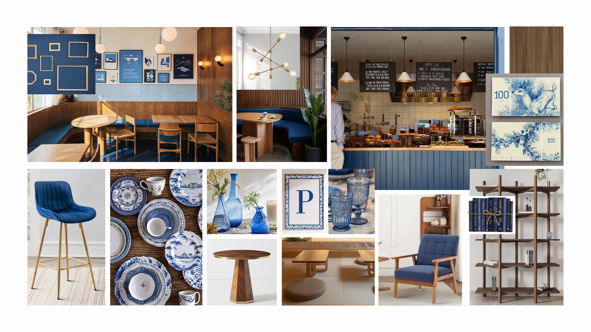
To inform my design direction, I curated a Pinterest Board exploring cozy, academic-friendly café aesthetics with influences that align with the café’s name and vibe. The blue palette really came to life with the warm wood tones.
This visual research helped shape both the spatial design and digital presence of Pound Coffee.
Physical Space
-

Brainstorming
I began the Pound Coffee rebrand by sketching early layout ideas, combining top-down floor plans with bubble diagrams to explore spatial relationships. This helped me visualize how students might move through and use the space.
- Sketched multiple furniture & seating layouts
- Mapped out zones for ordering, studying, and socializing through bubble diagrams
- Explored circulation flow from entry to pickup
These quick concepts laid the foundation for a more intuitive and student-friendly café design.
-

Circulation Planning & Flow
I created sketches that mapped out movement patterns, helping me visualize how customers interact with the space. These sketches evolved into detailed floor plans that identified and zoned:
- Communal seating areas
- Quiet study zones
- Comfortable lounge spaces
- Optimized ordering and pickup pathwaysThis foundational step ensured the final space would be both accessible and intuitive for customers to navigate.
-

Functionality
Using my circulation sketches as a base, I refined a layout that prioritized usability and variety:
- A study bar at the back of the café for quieter, individual work/study
- A central communal table for group meetups
- Reoriented booth seating for efficiency & comfort
- Cozy, floor seating area inspired by Asian culture
- A revamped counter layout and new pickup window to streamline efficient ordering & serviceThis blend of functional design and ambiance ensured the café could serve multiple student needs while remaining visually appealing.
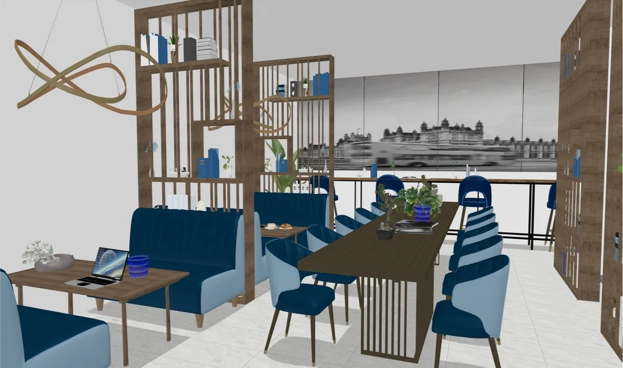
In the development phase, spatial layouts were refined into detailed mockups emphasizing:
Cohesive branding with consistent use of the café's blue theme, gold accents, dark wood textures, and greenery
Improved functionality and flow through strategic repositioning of seating, ordering areas, and more
This was my first time using Coohom, a spatial visualization tool. I selected and customized furniture from its library to match my color palette and style direction. Despite a learning curve, I loved seeing the space come to life through the detailed 3D renderings.
Design Development

Using Coohom, I developed a full mockup of Pound Coffee’s refreshed interior, focusing on comfort, function, and brand alignment. Key features include:
Central communal table for group seating
Quiet study bar along the back wall
South Korean-inspired floor seating for a cozy, cultural touch
Streamlined counter and pickup area for smoother flow
Furniture choices, textures, and layout were carefully selected to create a warm, cohesive atmosphere.
Final Physical Redesign
Digital Space
-

Information Architecture
Using Mural, I structured the site into 4 simple navigation tabs to support both the cafe’s digital goals in order to drive traffic and sales in store.
-
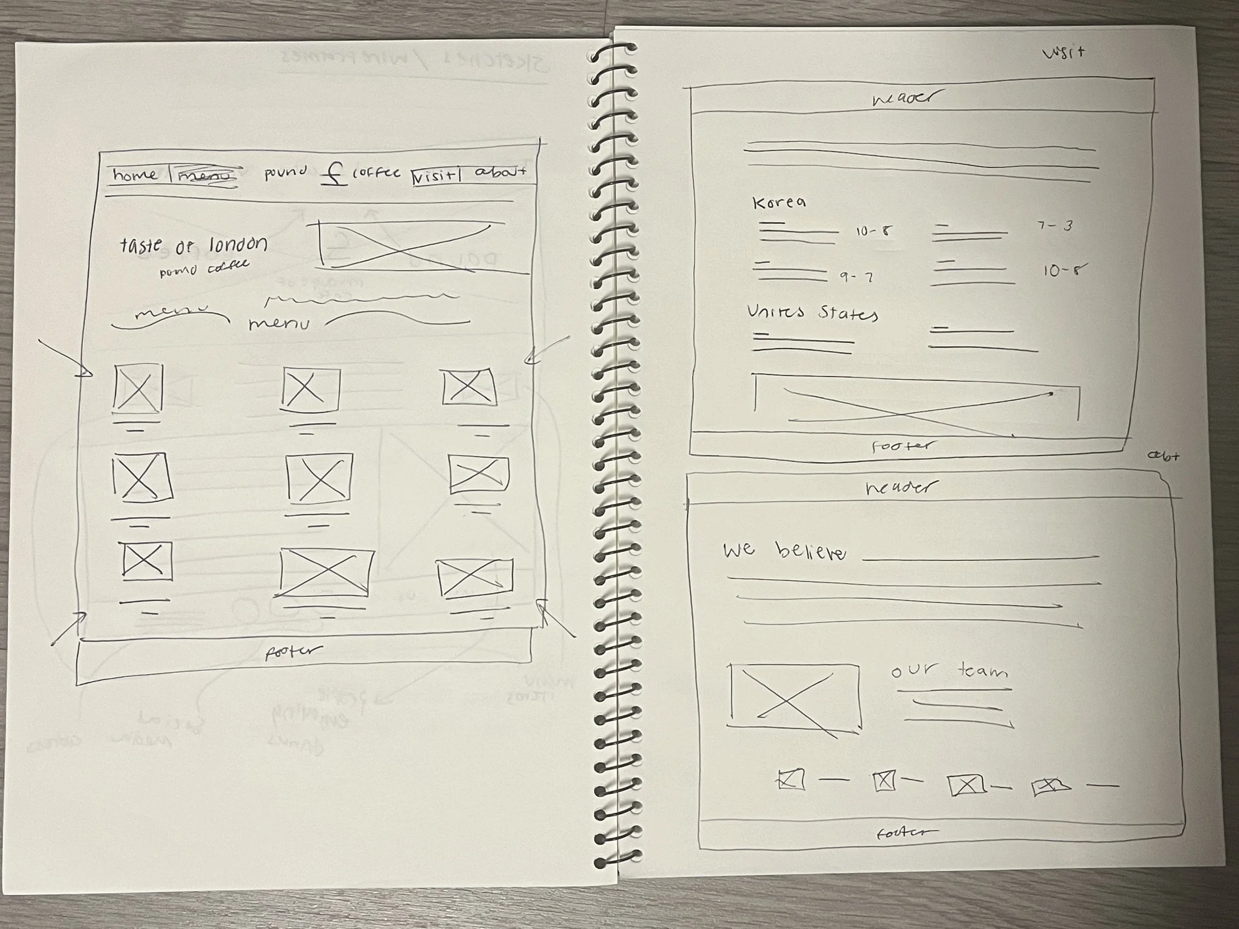
Wireframes
Low-fidelity sketches structured the core site experience for the user, focusing on simplicity and clear navigation.
-

Brand Identity
To design the site as an extension of the cafe, it was necessary to built its brand identity with blue tones, clean text and an overall sense of calmness.
-

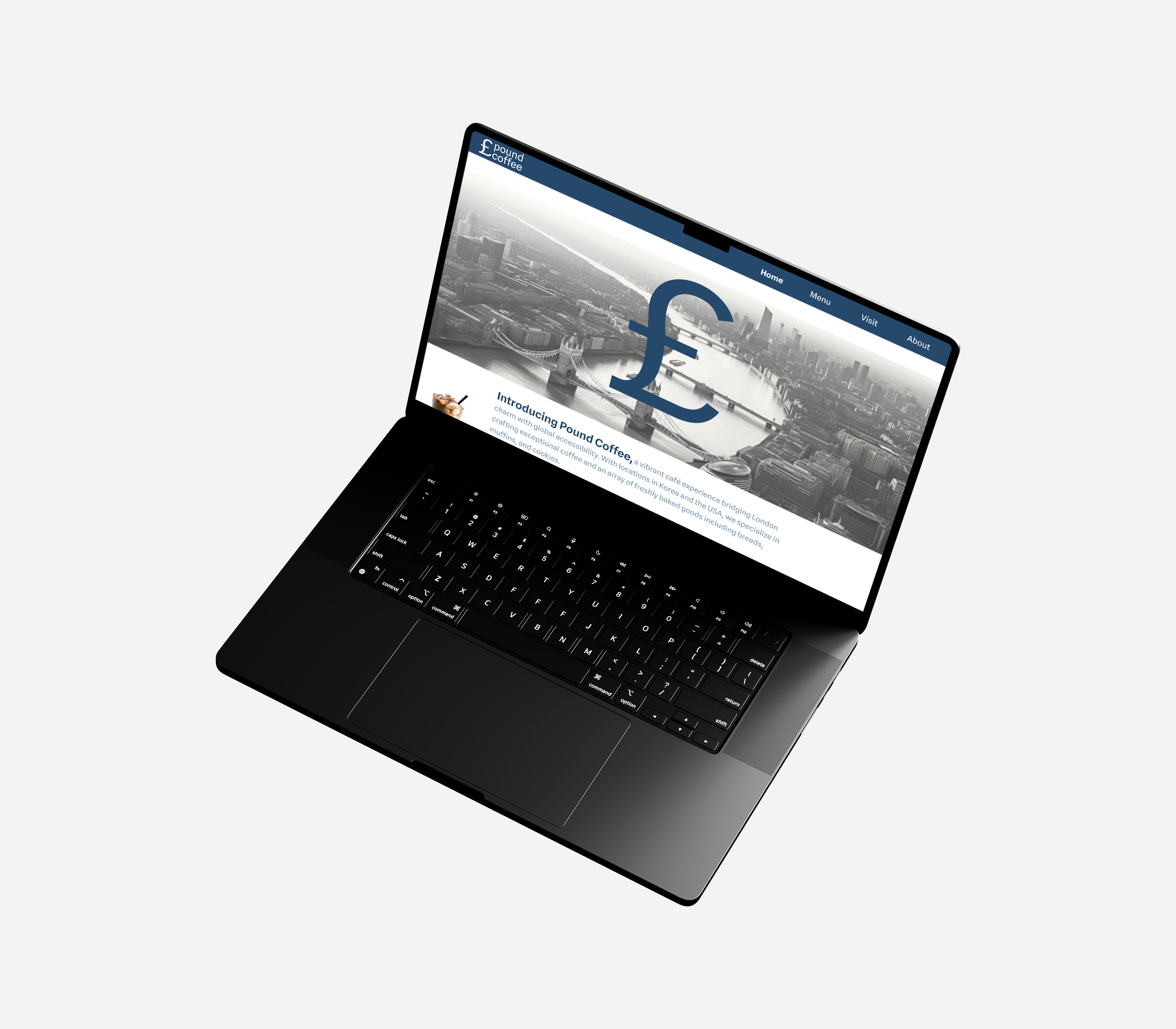
Website Prototype
A high-fidelity web mockup was designed in Figma. I developing a simple, user-friendly website to mirror the ambiance of the café itself.
The website prototype was designed in Figma to mirror the welcoming, user-friendly vibe of the café. It features:
Simple, intuitive navigation: Home, Menu, Visit, About
Visual menu showcasing drinks and treats
Visit page with clear location and hours
An About page sharing the café’s story
The site prioritizes clarity and accessibility, making it easy for customers to explore and connect with Pound Coffee, whether in-person or online.
Final Digital Space

If this Redesign launched, success for Pound Coffee would include:
Optimized café layout, significantly enhancing customer comfort and efficiency
Strengthened brand identity with cohesive visual and spatial design
Established comprehensive digital presence, boosting accessibility and engagement
These indicators would validate both the functional utility and digital connection for the cafe’s space.
Impact & Outcomes
Through this conceptual redesign, I gained valuable insights into:
Integrating cohesive aesthetics with usability
Importance of branding across physical & digital spaces
Principles of spatial and interior design and practical digital prototyping skills
This experience reinforced the value of comprehensive, user-centered approaches, marking my initial yet impactful exploration into spatial design, a field I intend to further explore.