

Drop A Pin Mobile App
A visual and location based discovery app to uncover hidden gems and support small businesses by seeing, saving and sharing.
Timeline: 7 weeks (2025)
Tools: Adobe Illustrator, Figma, Mural, Pinterest, Google Suite
Role: UX/UI Designer, Researcher & Strategist
Project Type: Concept UX/UI App Development
Drop A Pin is a conceptual mobile app that blends the visual inspiration of Pinterest with the navigational power of Google Maps.
It is a location-based, visual platform where people can find and share meaningful places, like cozy cafés, scenic lookouts, or vintage shops. Users can organize these locations into personalized boards to revisit favorite spots, plan future trips, and curate aesthetic travel collections.
As the UX/UI designer, I led the end-to-end design, from user research and strategy to branding and prototyping. The final result is a fully functional high-fidelity prototype that highlights user-first discovery, aesthetic organization, and local business visibility.
Summary
Based on user research, travel lovers and everyday explorers need a more visual, social way to document and share places. Currently:
Users rely on screenshots, texts, or notes that lack context and visual appeal
There’s no seamless tool that blends aesthetic memory-keeping with practical navigation
Existing tools feel cluttered and impersonal
Everyday travelers need a platform to visually save and share meaningful locations so they can build curated travel memories, support local businesses, and plan future trips with intention. Users want one platform that can be both practical and personal as a visual memory map, not just a checklist.
The Problem
Target Audience
DropaPin is designed for Gen Z and Millennial explorers who value visual storytelling, thoughtful design, and intentional experiences. These users are:
Socially connected and visually driven
Intentional about saving travel memories
Supportive of local and small businesses
Interested in tools that feel both aesthetic and practical
This audience is drawn to curated experiences that balance inspiration with functionality.
Develop a cohesive and expressive visual identity
Design an intuitive UX that blends map functionality with visual lists/boards
Celebrate small local businesses around the world and user-generated content (reviews, pictures)
Build features for curation, exploration, and shared memory-making
As the UX/UI Designer, I guided the full concept development and interface design experience.
Our Objectives
I conducted a competitive analysis to understand where Drop A Pin could stand out among existing location-discovery apps.
Trusted navigation tool with widespread use
Allows starred or labeled places but lacks visual hierarchy, aesthetics and visual exploration
Saved places are organized in flat, impersonal lists
Highly visual and inspiring; great for planning ideas
No geolocation or real-world mapping functionality
Can’t create practical itineraries or explore nearby locations
Designed for curated, aesthetic map browsing
UI can feel cluttered or outdated
Minimal community engagement or personal interaction
Focuses on small business promotion
Feels like a business directory more than a social tool
Lacks visual storytelling and modern mobile UX
Competitor Research
A need for a visual-first, emotionally resonant platform that turns saved places into meaningful experiences
An opportunity to blend Pinterest-style inspiration with real-time map functionality
A way to celebrate local businesses in a personal, story-driven context
A platform that builds community through shared boards and collaborative pinning
These insights helped position Drop A Pin as a mobile-first discovery app that is both functional and expressive, balancing utility with memory-making.
Drop A Pin’s brand direction balances organization with creative energy, just like the interface. The use of clean lines, warm tones, and an adventurous orange highlight helps create a user experience that’s unique, while feeling exciting and inspiring.
Strategic Takeaways
Brand Identity
-

Typography
MuseoModerno: Friendly, fun and inviting text style for headers
Estedad-VF: Approachable, mobile-friendly & readable for body text
-

Color Pallete
I experimented with five colors, but narrowed it down:
Navy Blue: Trust, navigation, clarity
Rust Orange: Energy, creativity
Background Beige: Warmth, balance -

Logo Design
Through sketches, iterations, and critiques, I arrived at two logo concepts shown above.
The final logo integrates a map pin visually reinforcing the concept of dropping a pinned location through sharing photos or adding to lists.
UX/UI Design Process
-

Information Architecture
Using Mural, I mapped out the 5 main screens: the welcome page, home feed, map, boards, and user profile. Each section supports specific app features.
-

Wireframes
Explored various low-fidelity sketches to refine layout, usability, and overall visual direction. I used the wireframes to visualize the app’s navigational design before creating the protoype.
-

User Flows
User flow mapping helped define how users would move through the app to complete key actions. This example shows onboarding to the home screen and Interacting or saving a post.
-
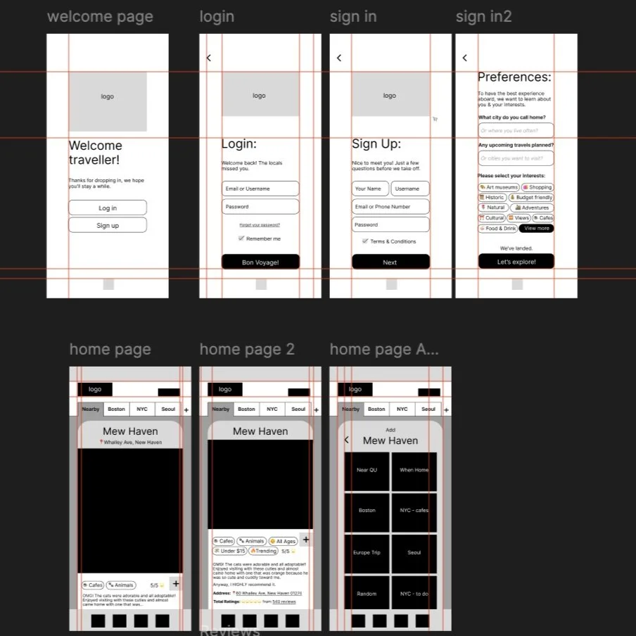
Responsive Prototypes
High-fidelity mockups were designed in Figma for the mobile app. The final design system applied brand visuals however, the above image showcases the black & white layout version.
The final deliverables included:
A fully interactive Figma prototype
UI Kit (color system, icon set, button states)
User flows and IA documentation
The result: A new way to explore, save and share your favorite places, hidden gems, or small businesses around the world.
The Solution

This conceptual project demonstrated my ability to:
Research & strategically conceptualize an application
Design intuitive, end-to-end mobile experiences
Balance emotional storytelling with user functionality
If launched, Drop A Pin would aim to increase:
Engagement through saved pins and visual boards
Small business visibility via reviews and image discovery
User satisfaction through social sharing and collaborative planning
These indicators would validate both the functional utility and emotional connection of the app.
Impact & Outcomes
Key Takeaways
Drop A Pin pushed me to rethink how digital travel tools could feel l more community driven. It challenged me to lead every stage of design while staying rooted in user needs and desires.
Through visual hierarchy, warm color contrasts, and map-based storytelling, I created a product concept that’s as intentional as the people who would use it.
This project strengthened my skills to:
Build full mobile UX systems
Guide projects from research to prototype
Create joyful, design-led digital experiences