
K-CON Event Digital Campaign
Designing a speculative campaign to enhance the branded digital collateral for a global Kpop fan convention, called K-CON.
Project Type: Speculative
Role: Email Blast Designer; Instagram Content Creator
Partner: Allison Canahui (Facebook Ad & Motion Designer)
Platforms: Email, Instagram, FaceBook
Tools: Adobe Illustrator
Timeline: 6 weeks (Fall 2024)


This speculative campaign explores how KCON, a global K-pop and Korean culture convention, could elevate its digital presence through vibrant, on-brand content. As part of a two-person team, I focused on designing a cohesive series of email and Instagram assets aimed at informing and exciting fans while staying aligned with the brand’s energetic identity. My partner contributed motion graphics and Facebook as content to further expand the campaign’s reach and adapt it across platforms.
Summary
KCON’s brand thrives on energy, community, and immersive fan experiences, and its digital presence should do that too.
Our objective was to design content that communicated event information clearly and quickly, without sacrificing the bold, playful tone fans expect. Balance was key in creating visuals that were scroll-worthy and exciting, yet organized and helpful. With a Gen Z audience that values both clarity and personality, the campaign needed to feel intentional, and true to the brand.
Our Objectives
Demographic: Gen Z (ages 16–25), primarily female
Location: US & Asia
Interests: K-pop, K-dramas, fashion, beauty
Behavior: Social media-first, engaged in countdowns, giveaways, and community content
Target Audience

Before beginning the design process, we conducted research to understand best practices for visually communicating event details, as well as the preferences and digital behaviors of Gen Z fans.
Additionally we viewed K-CON’s largest competitors:
K-Pop World Festival
Focuses on South Korean audience
Colorful & informative presence
Asian Pop Festival
Focuses on South Korean & American audience
Visual & bright graphics
Discovery & Research
We also pulled design references from platforms like Pinterest to spark layout and formatting ideas.
We began with sketching and brainstorming a range of content ideas concepts including
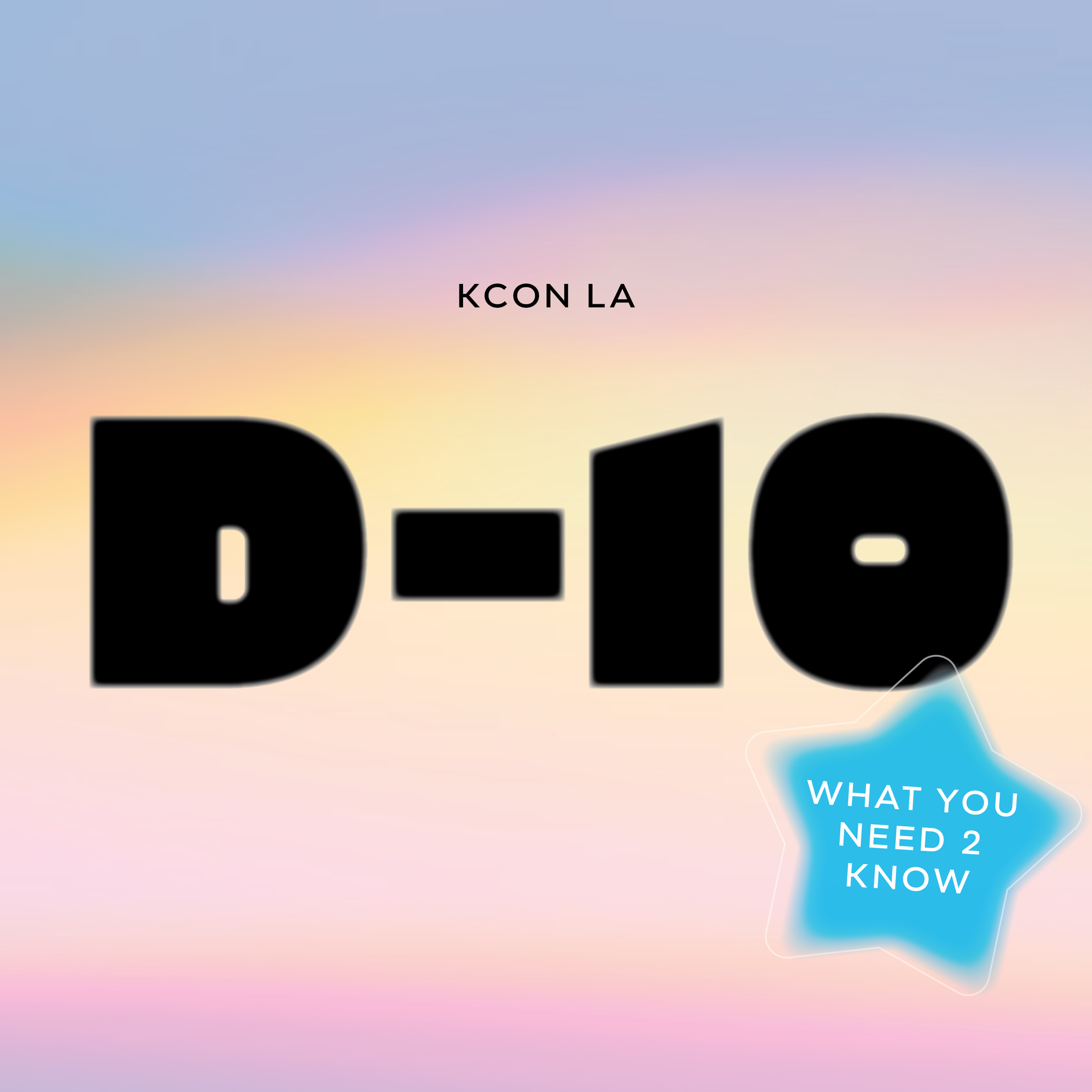
Informational: share new locations, tips/tricks, details of upcoming events, where to watch
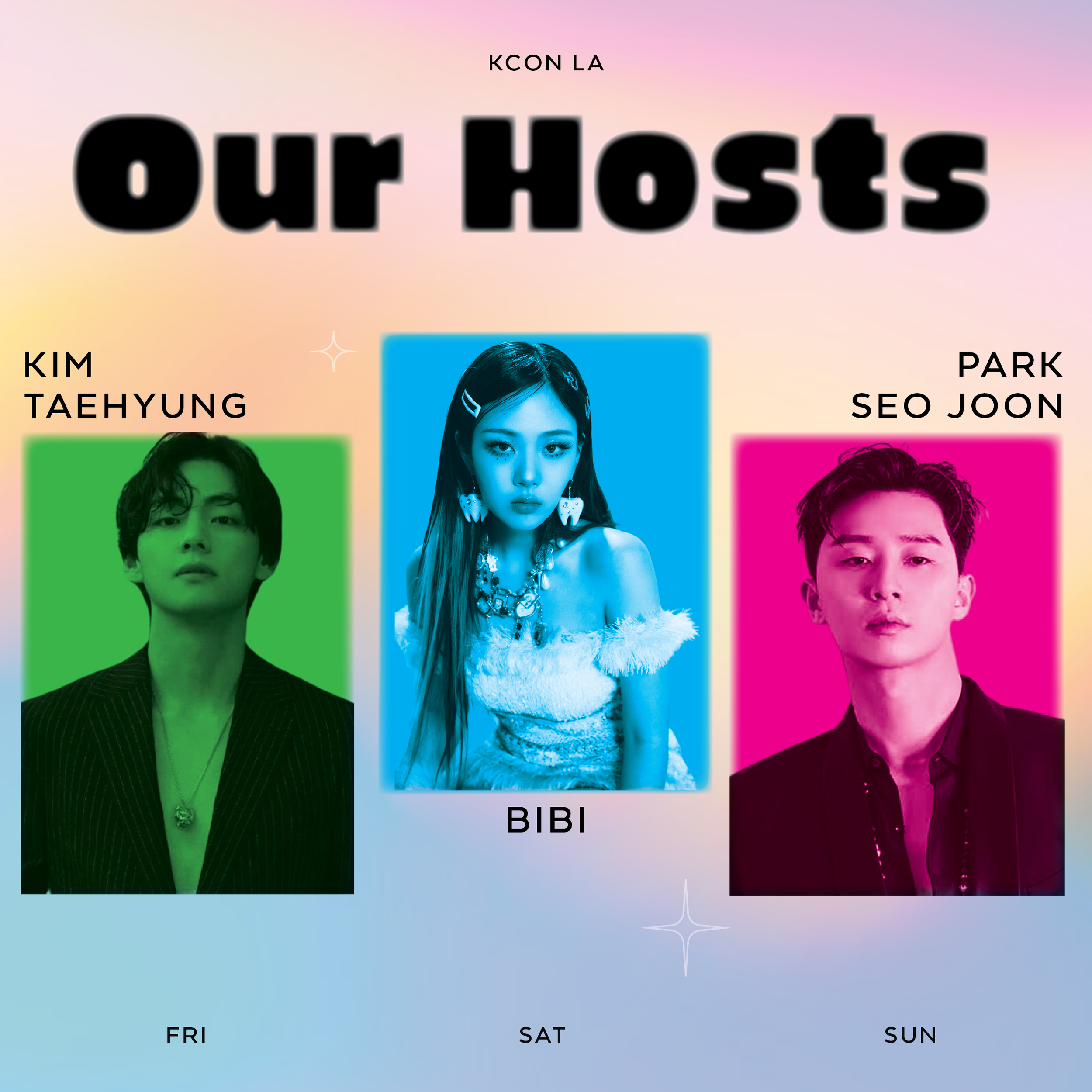
Promotional CTA: sharing artist spotlight (announcement)
Interest & Engagement: Lineup previews/ sneak peaks
Ideation & Exploration

As for our branding, we wanted to keep the colorful, fun and bold look for KCON while creating a new updated look. We wanted the overall feel to be energetic, bold, cute, & shareable.
Color Palette:
Bright gradient background
Blue, yellow, pink & green
Typography:
Elevated Visual Identity
-
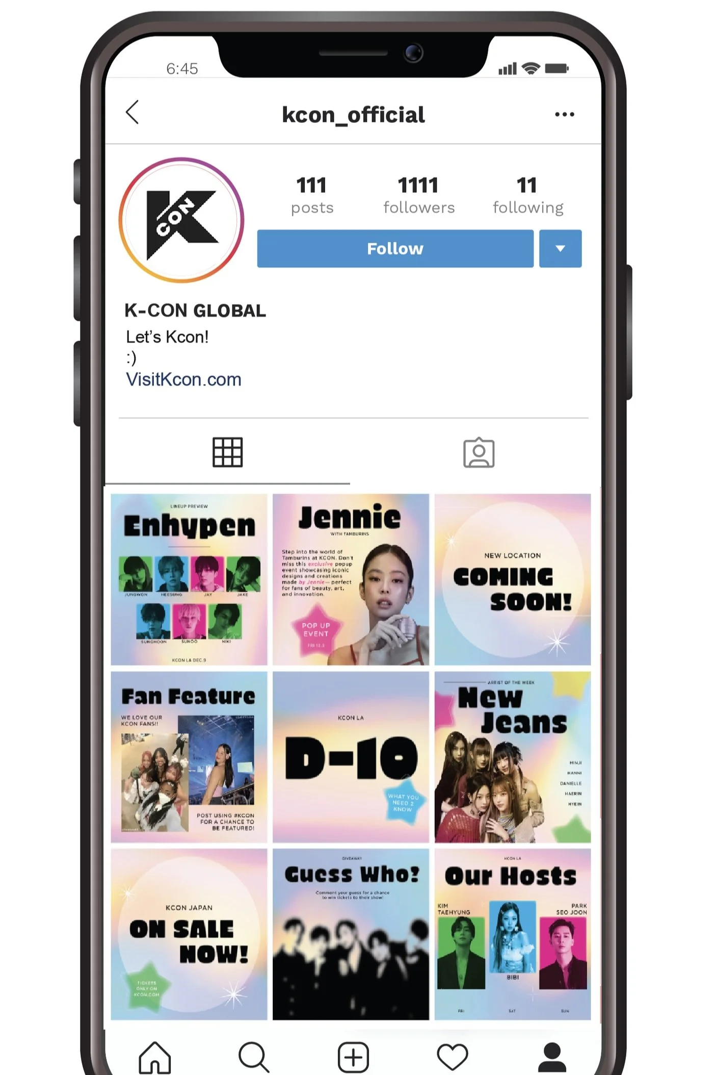
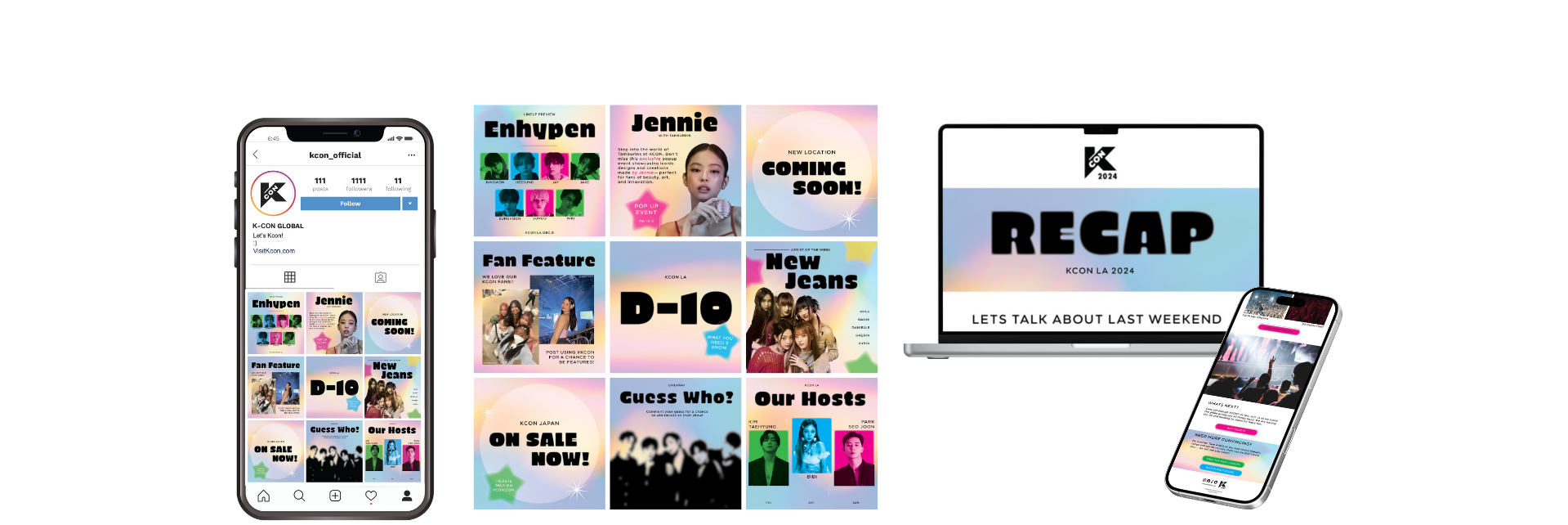
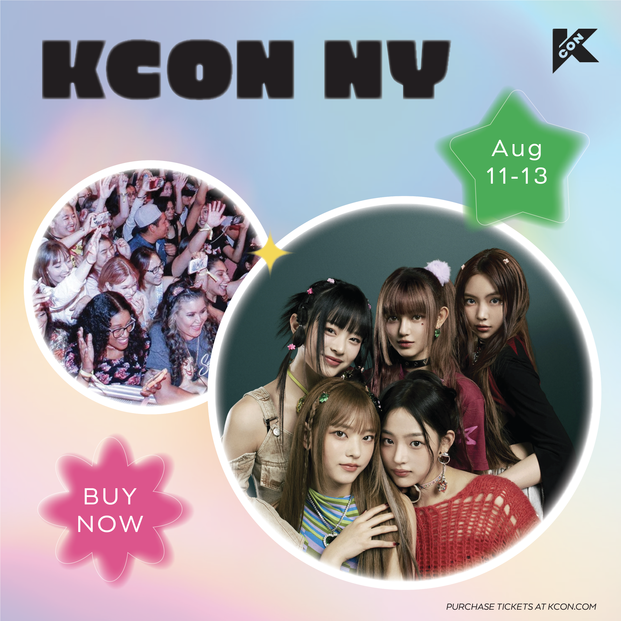
Instagram Content
Versatile Instagram layout that can be easily updated ensuring consistency in content creation while utilizing brand colors, elements and typography.
-
Facebook Ad Content
Adapted static ads and promo graphics to align with Facebook’s layout and audience, focusing on clear information and vibrant visuals.
-

Email Blasts
Series of three email blasts each tailored to a specific topic/ CTA while maintaining vibrant gradients, bright colors, and cohesive KCON branding.
-

Motion Content
Short-form video content designed to boost excitement and visibility, including animated teaser posts and visuals for social channels.
The final deliverables included an evaluated visual identity that is consistent among three touch points:
Instagram
Visual, engaging & fun feed posts
Includes carousels & motion content
Facebook Ads
Clear CTA that engages & informs audience
Includes motion content
Email Blasts
Supports Launch, Pre-event, & Post-Event
Each piece was crafted to support digital outreach, helping KCON communicate clearly with their fans while connecting them to the festival they love.
The Deliverables
Email Blasts:


Motion:
Carousel:


Elevated a full outreach campaign around an existing brand presence
Balanced clarity with personality to meet the target audience, Gen Z’s, expectations
Strengthened my ability to design for multi-platforms
This speculative campaign reflects my approach to real-world branding: vibrant, intentional, and built with the audience in mind.
Impact & Outcomes
While I focused on the email series and Instagram content, my partner contributed additional assets (Facebook Ads & Motion Graphics) to expand KCON’s digital presence across platforms.
Our collaboration really brought the work to life and allowed us to keep visual consistency while tailoring content to each platform’s strengths. We wanted to ensure fans had an engaging, accessible experience no matter where they interacted with the brand.