

Design’s Impact on Digital Impulse Purchases
Have you ever bought something online without thinking, only to question your decision a few minutes later? If so, you’re not alone.
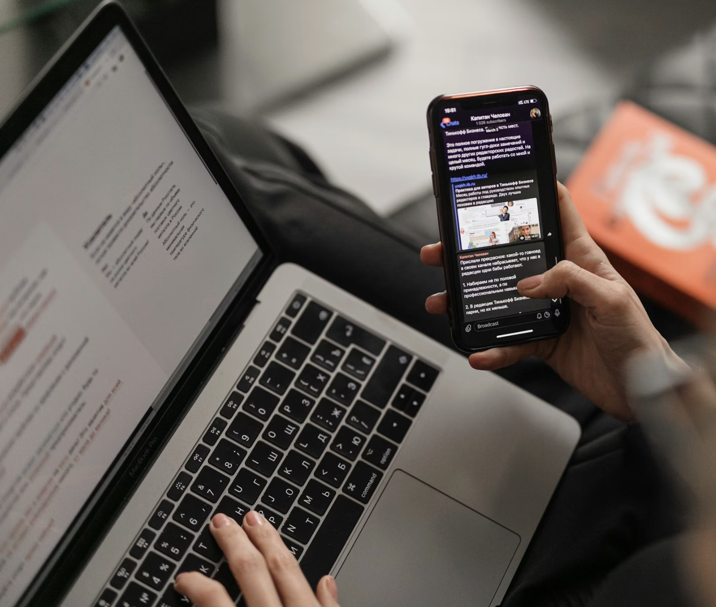
Scrolling, tapping then buying; It often happens so fast that we barely notice it. One second you’re watching a video or casually browsing, and the next, you’ve added something to your cart. That moment isn’t accidental. It’s designed.
A helpful way to think about modern digital experiences is to imagine an automatic sliding door versus a manual one. One opens effortlessly before you even think about it, while the other requires effort. Digital interfaces work the same way. When a design feels smooth, intuitive, and emotionally engaging, users move forward without hesitation. When friction appears, too many steps, confusing buttons, or overwhelming choices, momentum breaks.
This matters because we move through digital spaces incredibly fast. Attention spans are shorter, feeds are endless, and most of us skim rather than read. Designers aren’t creating experiences for slow, deliberate browsing anymore, instead, they’re designing for split-second decisions. That shift has made simplicity and clarity essential, not optional.
Frictionless design reduces mental effort by guiding users toward a clear next step. You see this everywhere: one-tap checkouts, large “Buy Now” buttons, autofilled forms, and minimal layouts. Behind the scenes, UX principles explain why this works. Fewer choices make decisions easier, and buttons placed exactly where your thumb naturally rests make action feel almost automatic.
Emotion plays an even bigger role. Most impulse purchases start with a feeling, not logic. Color, motion, imagery, and subtle animations create emotional cues that encourage users to keep moving. Even tiny details, like a button animation or small text that says “Trending” or “Only 2 left”, quietly add urgency without adding friction.
Visual perception also shapes these moments. Gestalt principles help users instantly understand what matters most on a screen. High contrast makes calls-to-action stand out. Grouped products feel naturally connected. Infinite scrolling keeps content flowing without pause. When visual hierarchy is clear, users don’t search for what to do next, rather, they already know.
Social media takes all of this to another level. Platforms like TikTok blur the line between content and commerce, turning shopping into part of the entertainment. Products are woven into routines, stories, and trends, making them feel relatable instead of promotional. Trends themselves act like visual shortcuts, familiar formats that are easy to process and emotionally engaging.
As digital experiences become more personalized and predictive through AI, designers face an important responsibility. Frictionless design can empower users, but it can also manipulate them if transparency is lost. The challenge is creating experiences that feel effortless while still respecting user choice.
If this topic interests you, I explore it much more deeply, through research, theory, and real-world examples in my full white paper…

Hey, I’m Ashley!
I am a graphic & interactive designer passionate about creating purposeful, fun, and engaging design. Whether it’s a brand identity, a responsive website, or a social media campaign, I love connecting ideas with strategy to make work that’s not only beautiful, but effective.